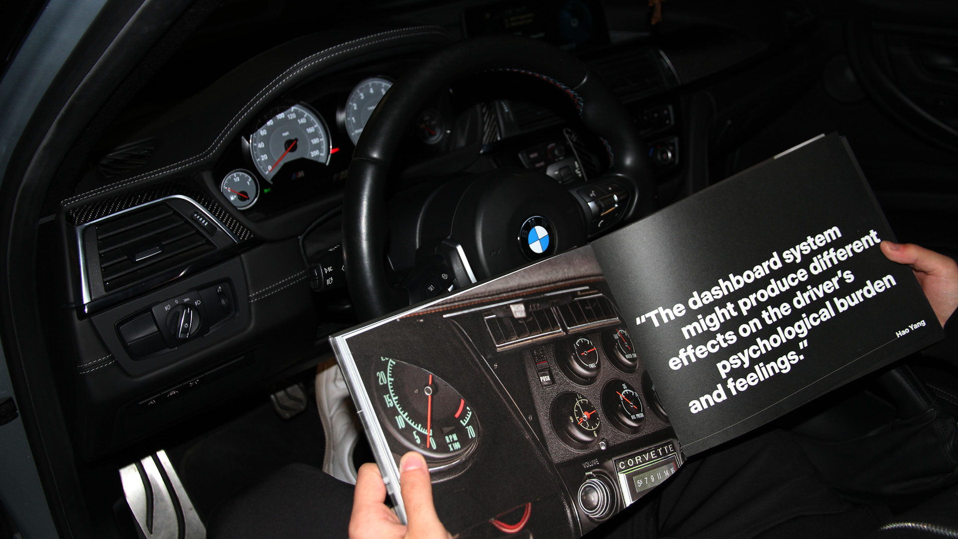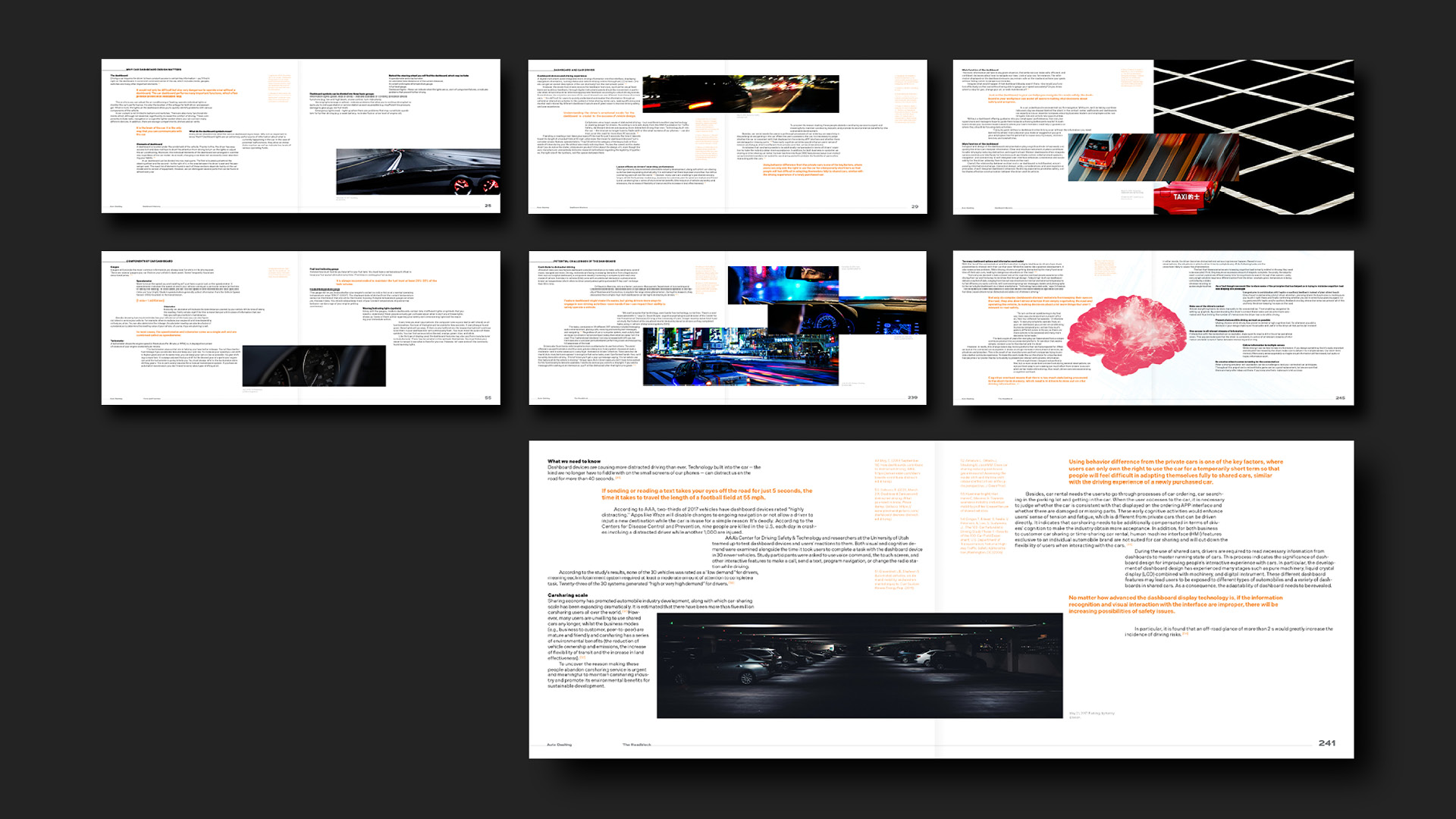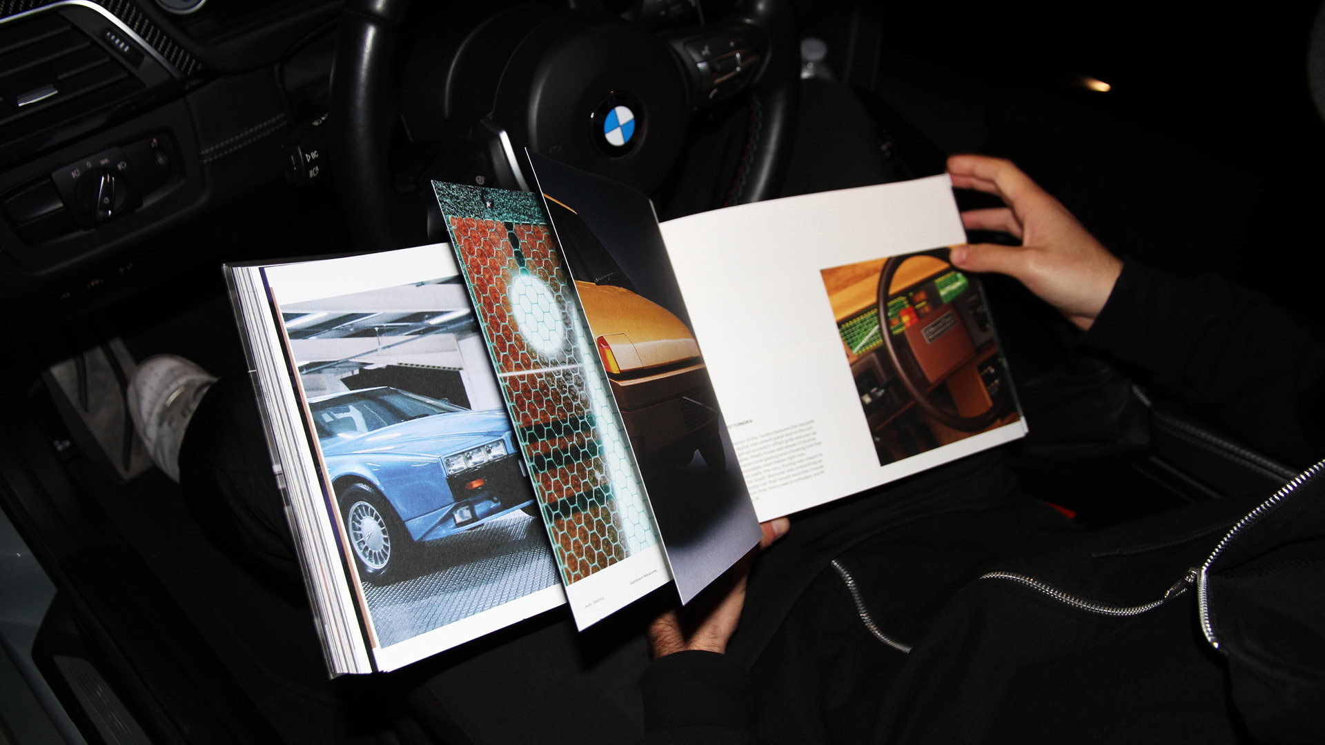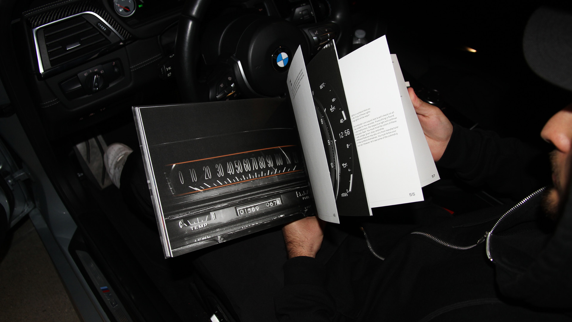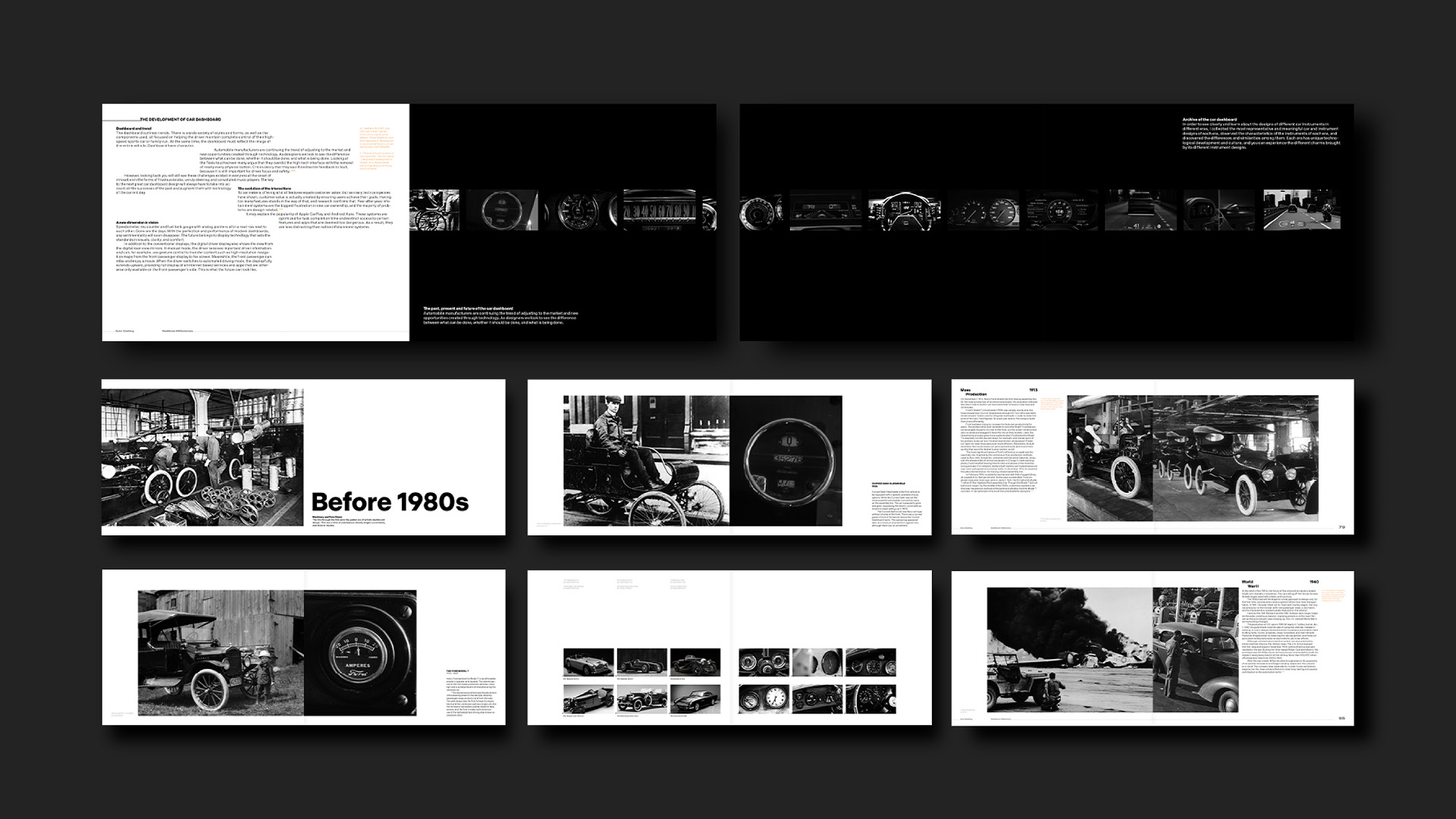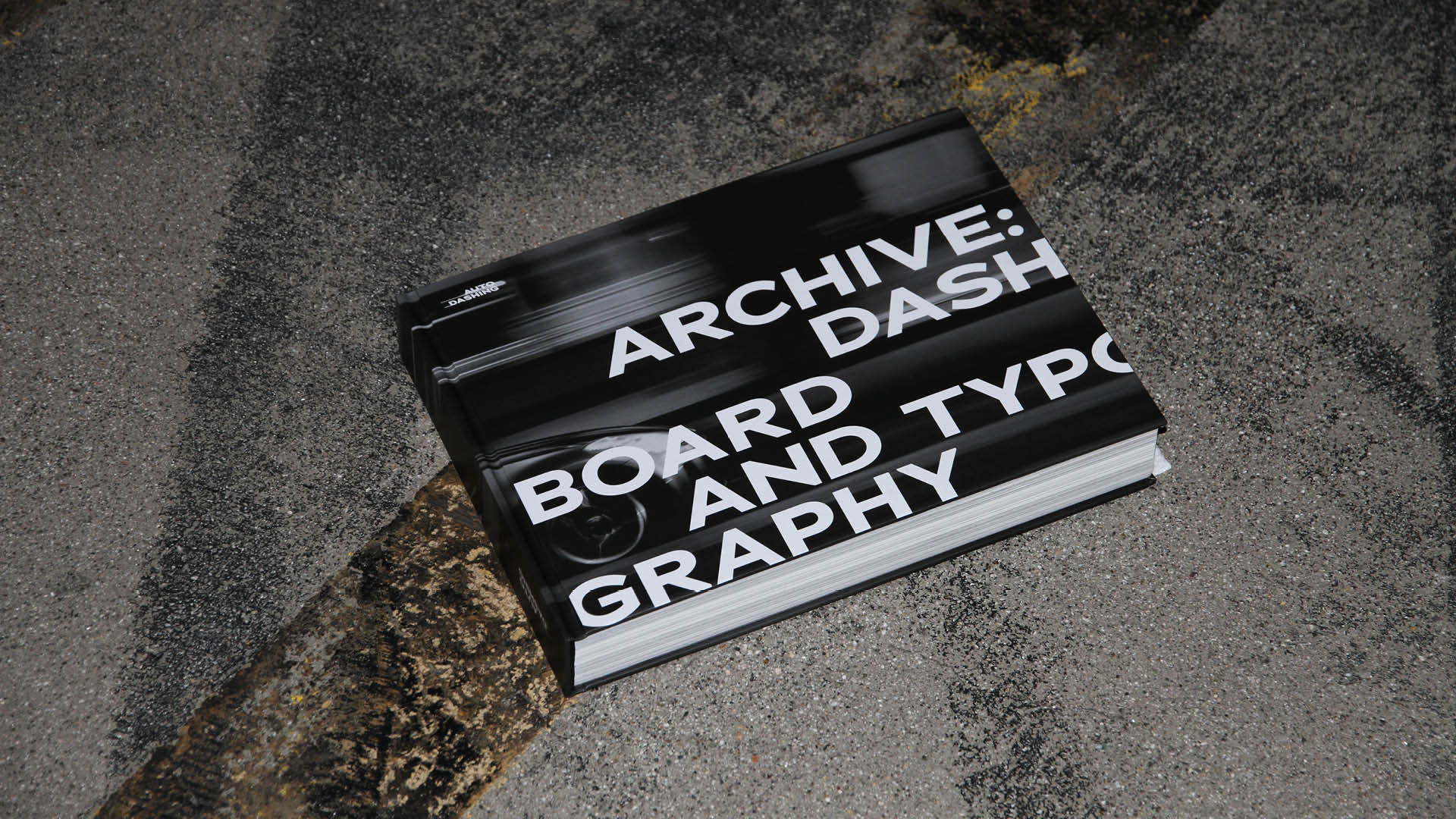
The Archive book is a research-intensive collection of car dashboards from the late 1800s to the 2020s. It discusses visual analysis of differences between the dashboard and the technology to depict the functions of designs.
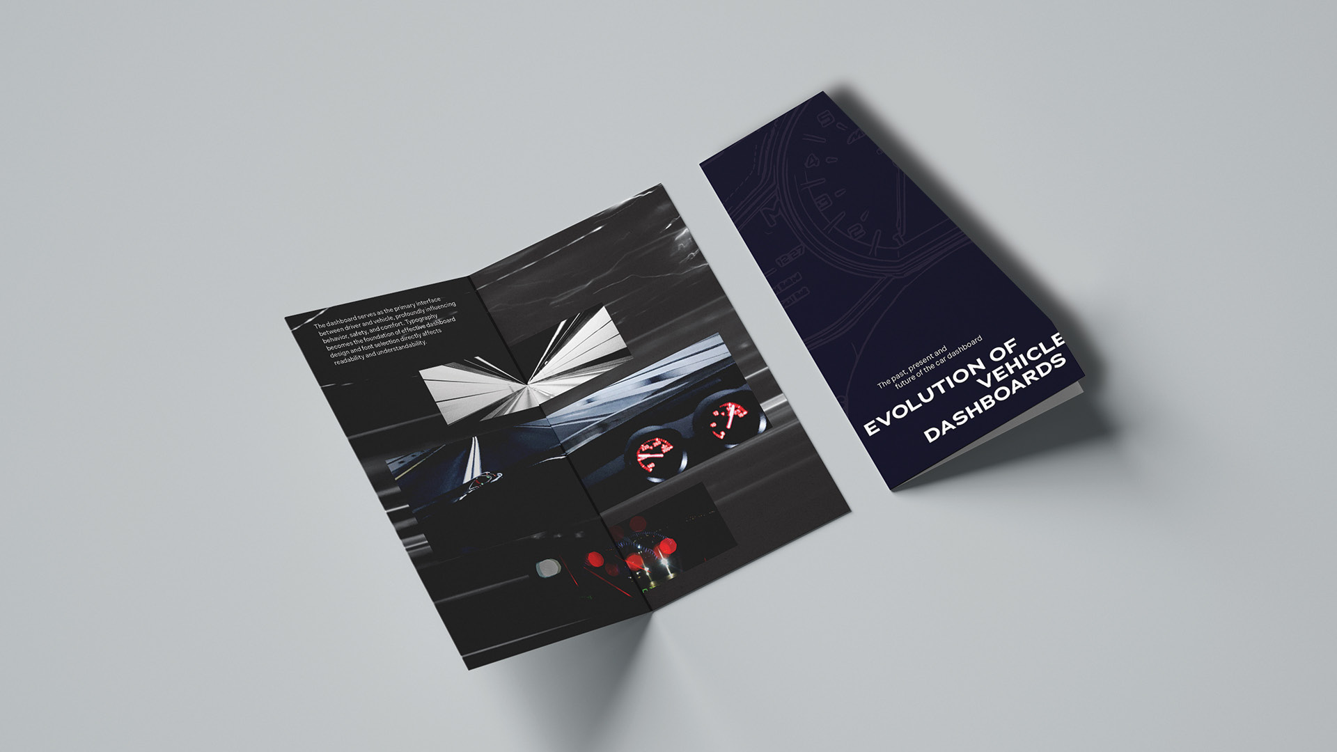
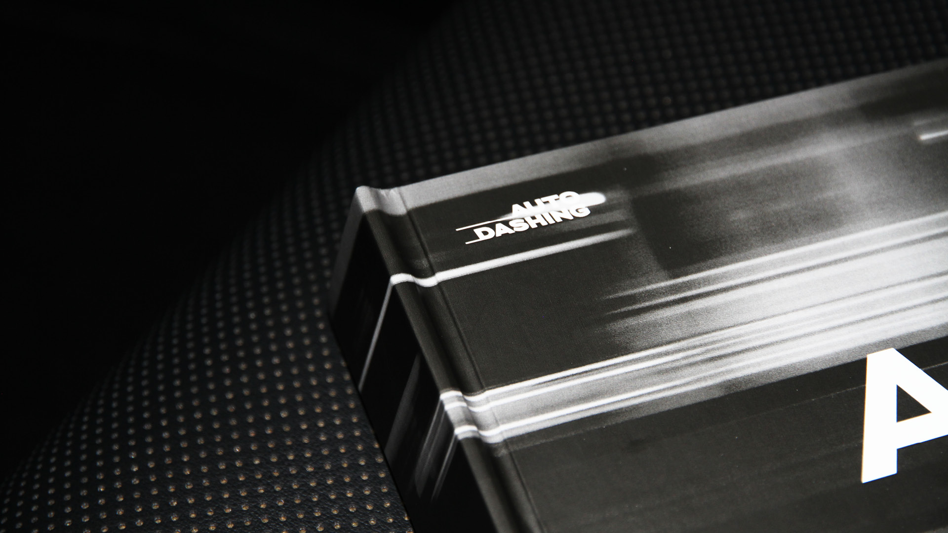
The cover uses the line effect produced by high-speed cars. Stacking typography creates the feeling of speed.
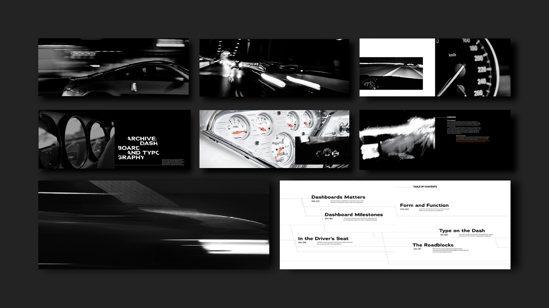
The introductory spread emphasizes the relationship between the car, the dashboard design, and the driver by using images of the car in action and dashboards. The black and white images communicate the feel and texture of a vehicle going at high speeds.
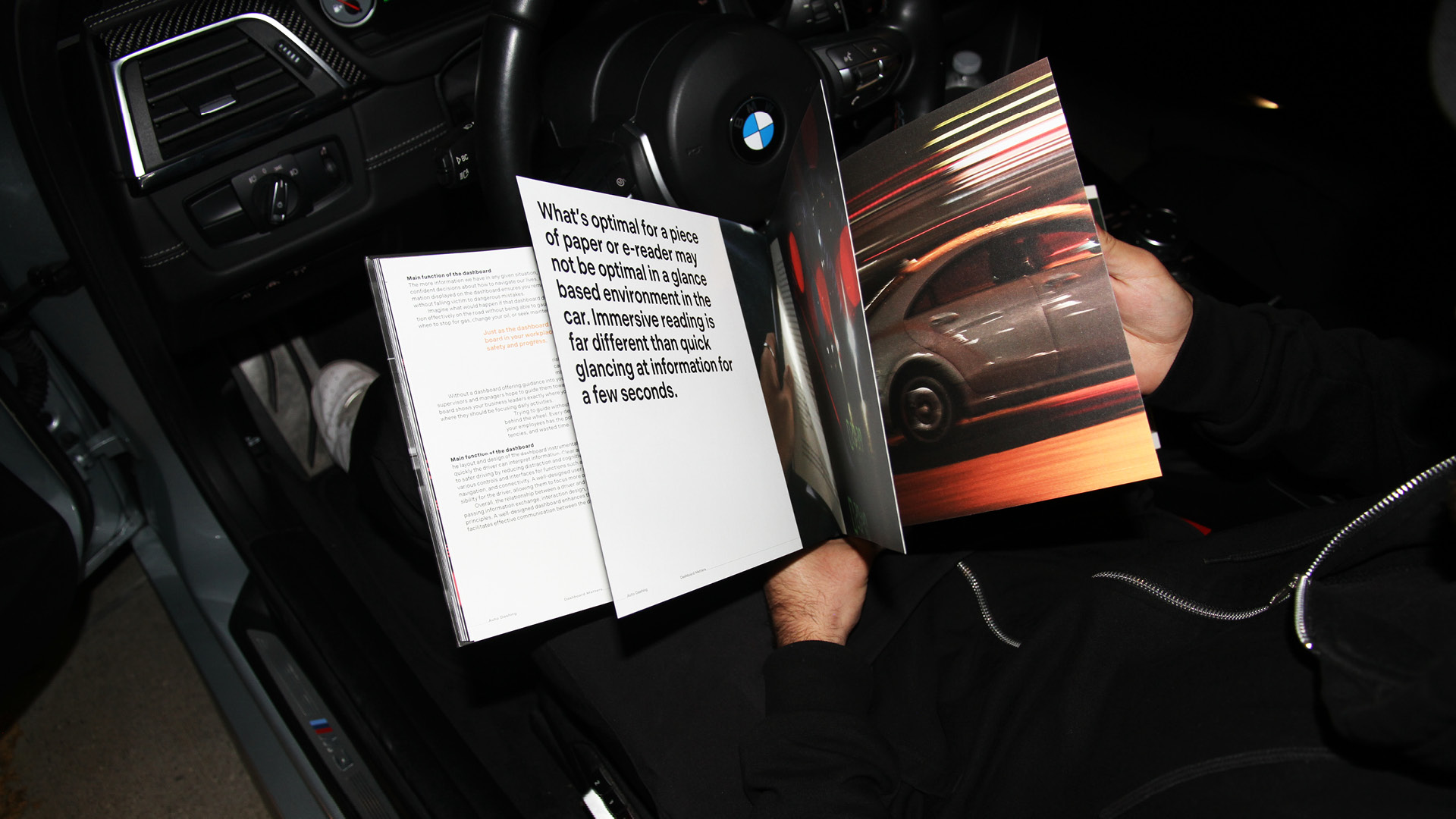
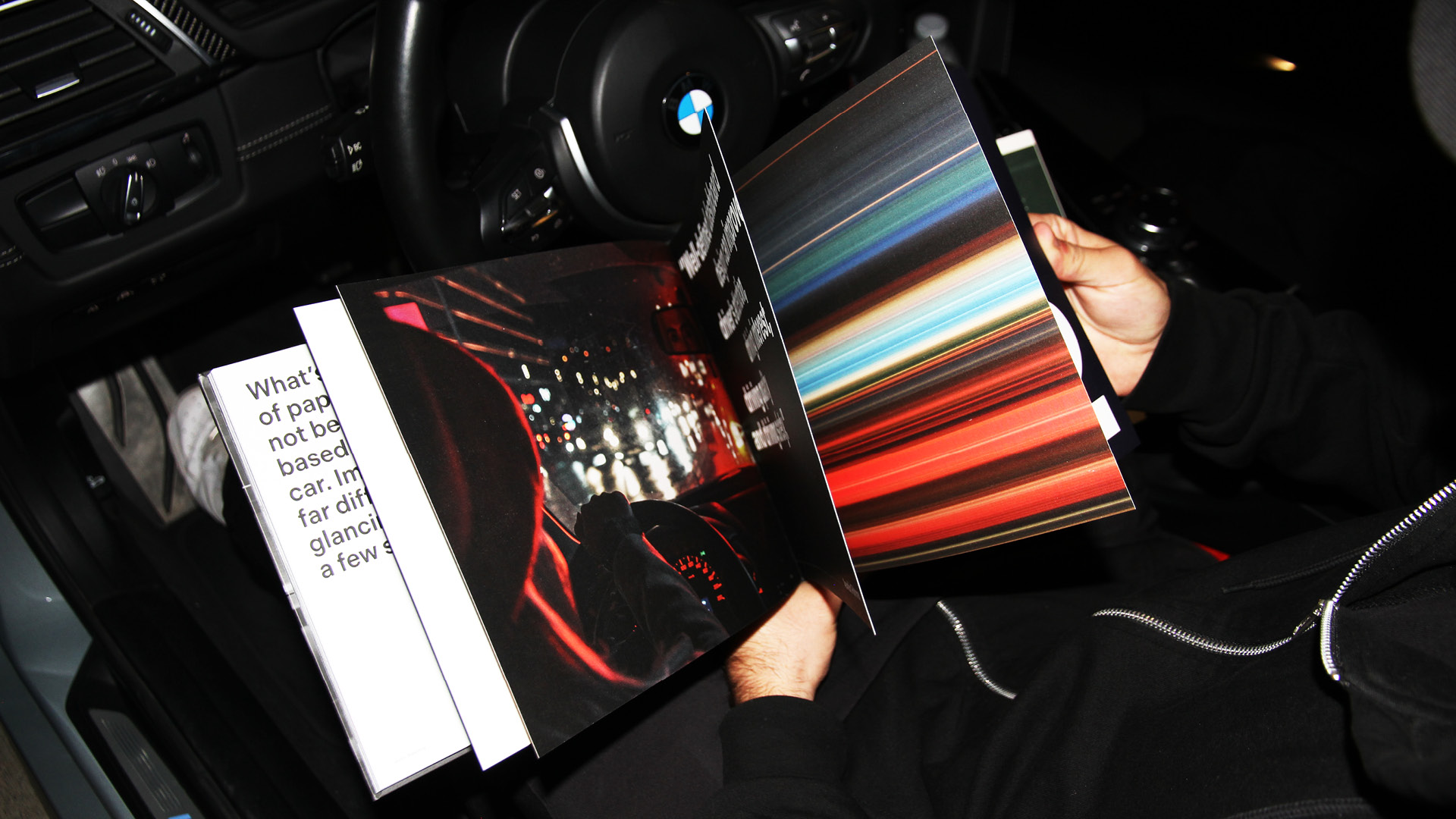
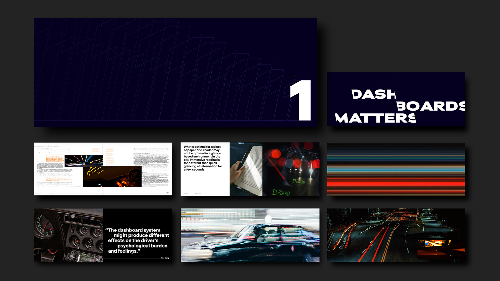
Speed-infused images, dashboards, and stacked typography are used throughout the book to create a high-speed driving environment.
A high-speed visual narrative is created through the use of typography. Reminiscent of sitting in the driver’s seat while driving a car.
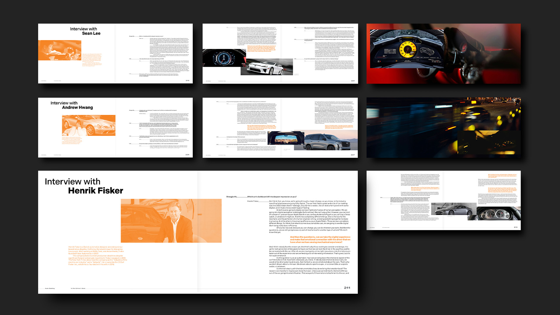
I also interviewed car collector, car designer, and graphic designer to consult their driving expertise, gauging whether they are affected by the dashboard and their thoughts on its development.
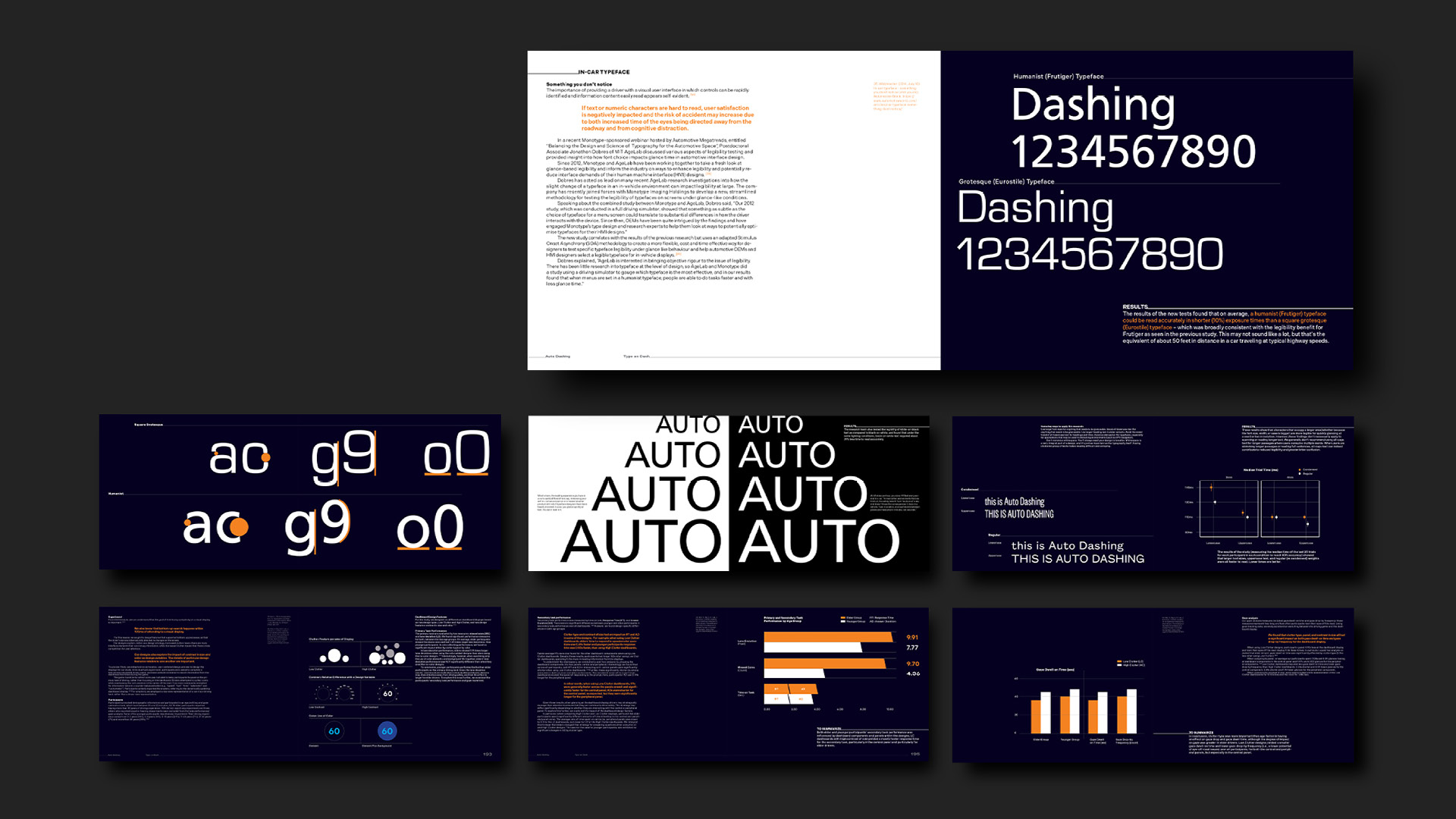
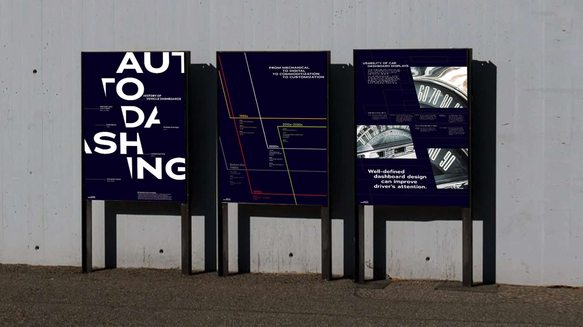
Rather than prescribing a single template for the “perfect” dashboard, Auto Dashing advocates understanding the principles of typography, hierarchy, and accessibility. Through different experimental data, we could observe how typography affects the driving experience. From the feature and form of different typefaces to the reaction time under a fast environment.
Each milestone—from the Model T revolutionizing mass production to the rise of electric vehicles signaling a shift towards sustainability—reflects societal needs, technological advancements, and the enduring spirit of exploration. When predicting future designs, it’s valuable to research insights from past designs to discern the results in a positive user experience.
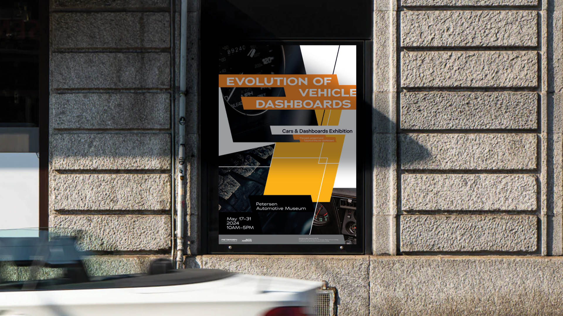
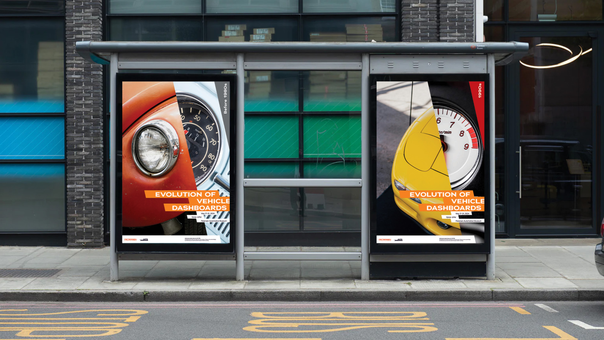
The exhibition allows the audience to feel the uniqueness of the different dashboards better with graphic elements to celebrate the aesthetics and stories hidden behind the dashboard.
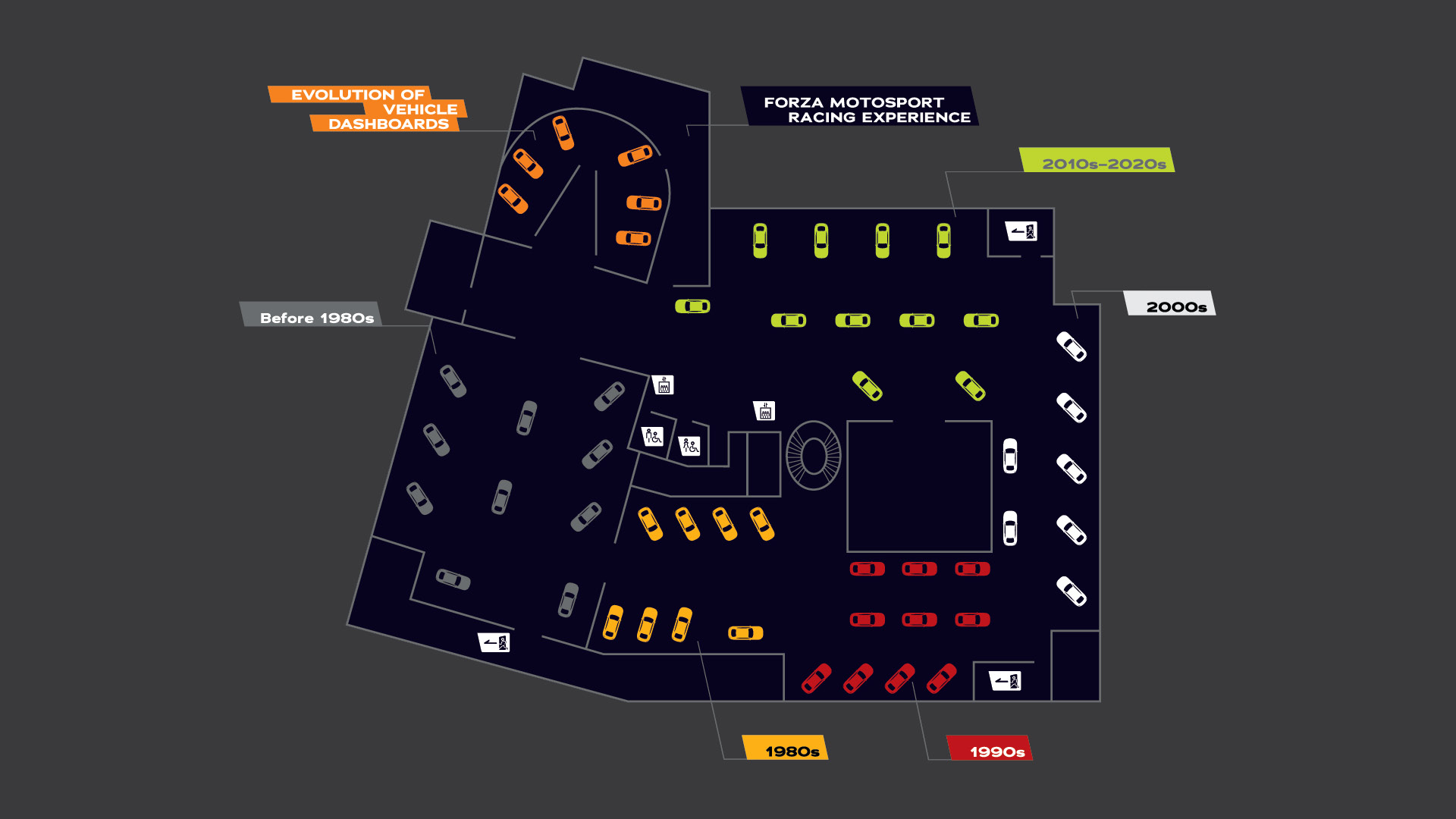
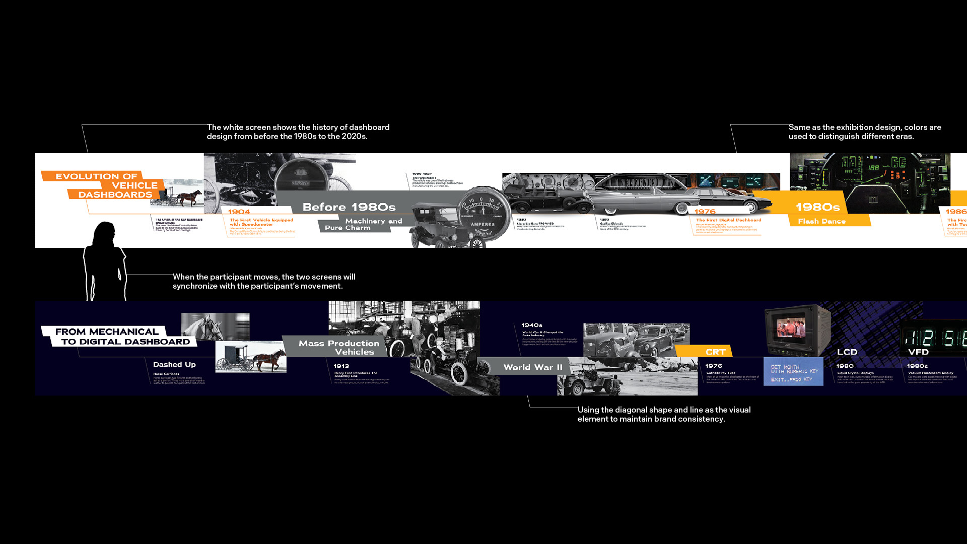
The 50s through the 80s were the golden era of artistic dashboard design. This was a time of ostentatious wheels, bright convertibles, and drive-in movies.
One of the coolest things in the 1980s was the rise of digital dashboards in cars, watches, and hi-fi equipment (just about everywhere), with their early video game.
The late 1980s and early 1990s were a crazy time for the Japanese car industry and for sports cars in particular. From the sporty to the standard we can see a shift from style to comfort emerge.
We have reached the point where technology companies are taking the approach of incorporating smartphone technology into cars.
Customization is going to be the major trend for car dashboard design because consumers want more individualization. The increased advances of technology will allow for further customization in the dashboard, giving vehicle owners the ability to flexibly determine their own car’s dashboard.
The Evolution of Vehicle Dashboards is an immersive video-based experience that allows viewers to navigate the story and design purpose behind the dashboard through the use of two screens, projected dashboards and historical events.
The primary logo was inspired by the sprinting effect of driving a car at night. It represents speed and driving conditions on the road, using a diagonal angle and extension line at the beginning of the letter to create a speedy atmosphere. This also represents the core purpose of Auto Dashing, which is to study the impact of car dashboard typography on the driver’s experience at high speeds.
Logomark evolved from a logotype, which took the form and shape of the primary logo. Make it one of the main visual elements to maintain brand consistency. Flexible to present in different mediums, it also builds the same environment while the car is traveling at a fast speed generating a dashing effect.
Posters are created in three different versions with different amounts of information. By using the visual elements and typography to maintain the visual continuity.
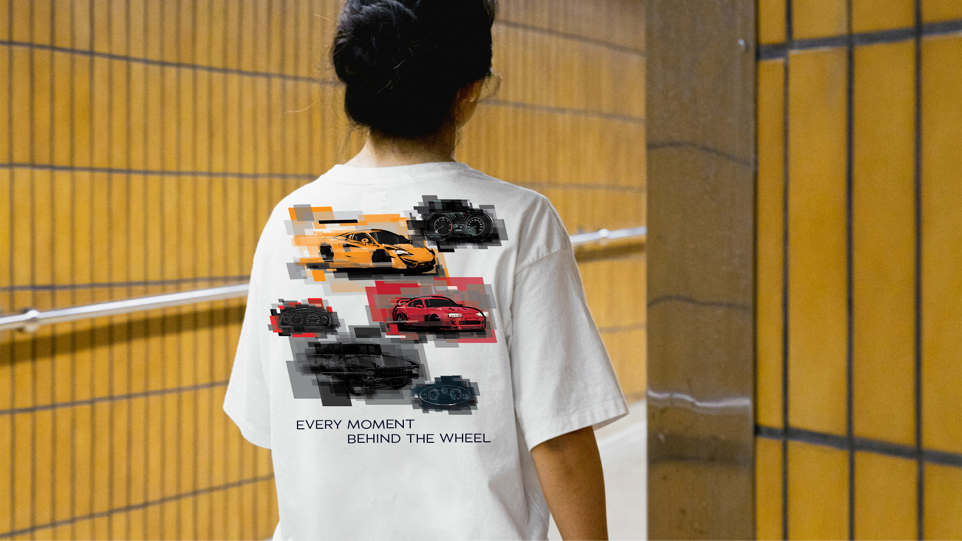
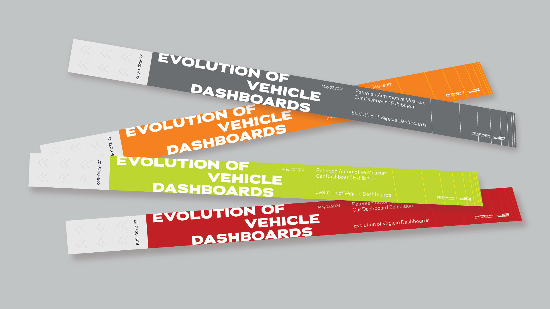
I used the geometric shape of a dash to create a series of promotional items to help the brand promote itself to the public.
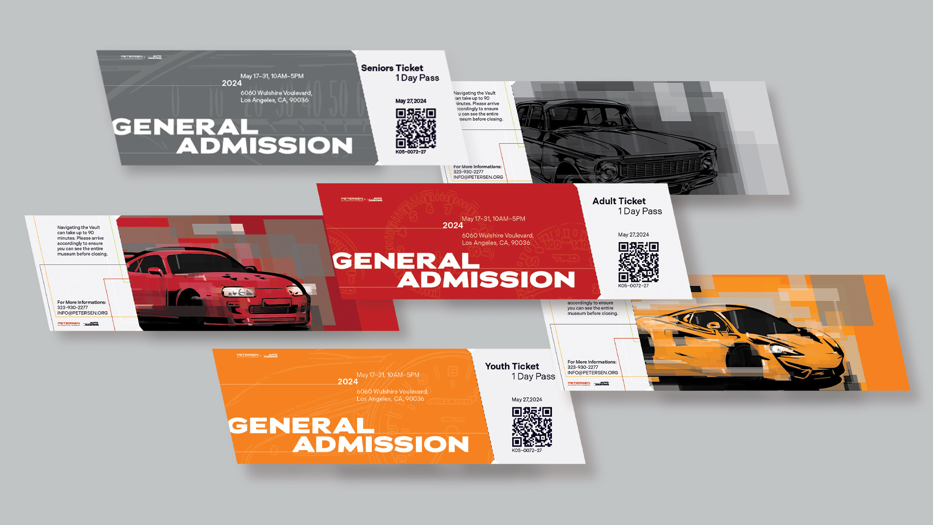
Tickets are designed in the shape of a dash. Illustrations of cars serve as the main image on the ticket to thematically link the brand with its subject while also demonstrating the inspiration for the logo.
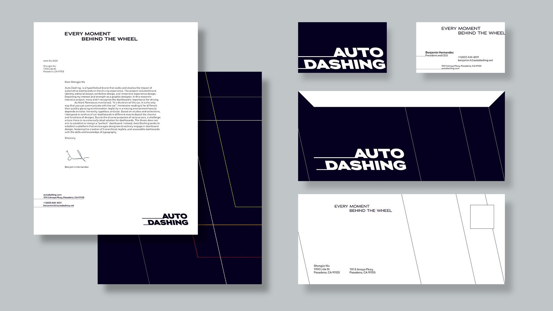
I created a stationery set that maintains a consistent brand identity by incorporating the logo and visual motifs into business cards, envelopes, and letterhead.
© 2024 Shengjie Wu. All Rights Reserved.