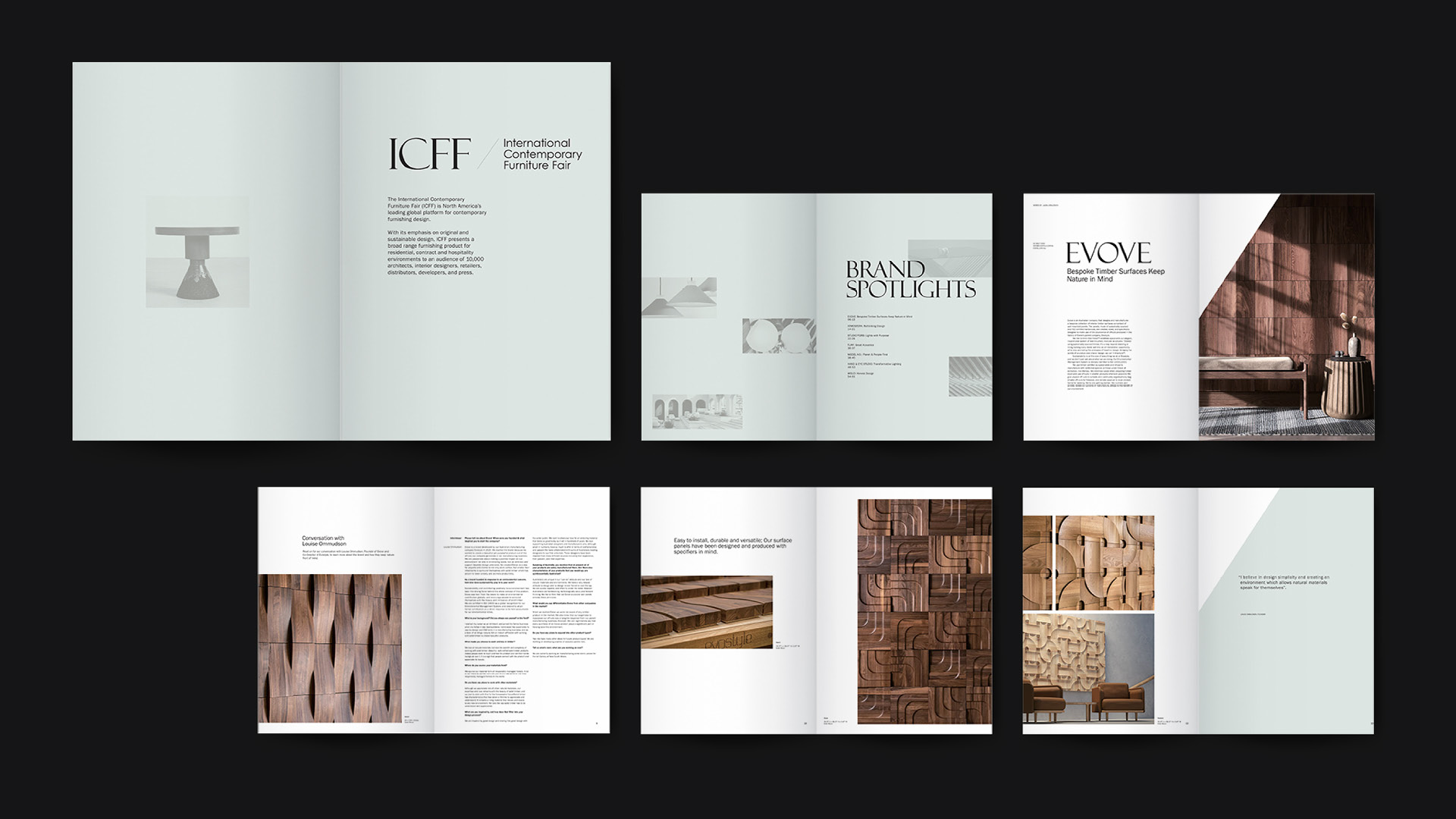
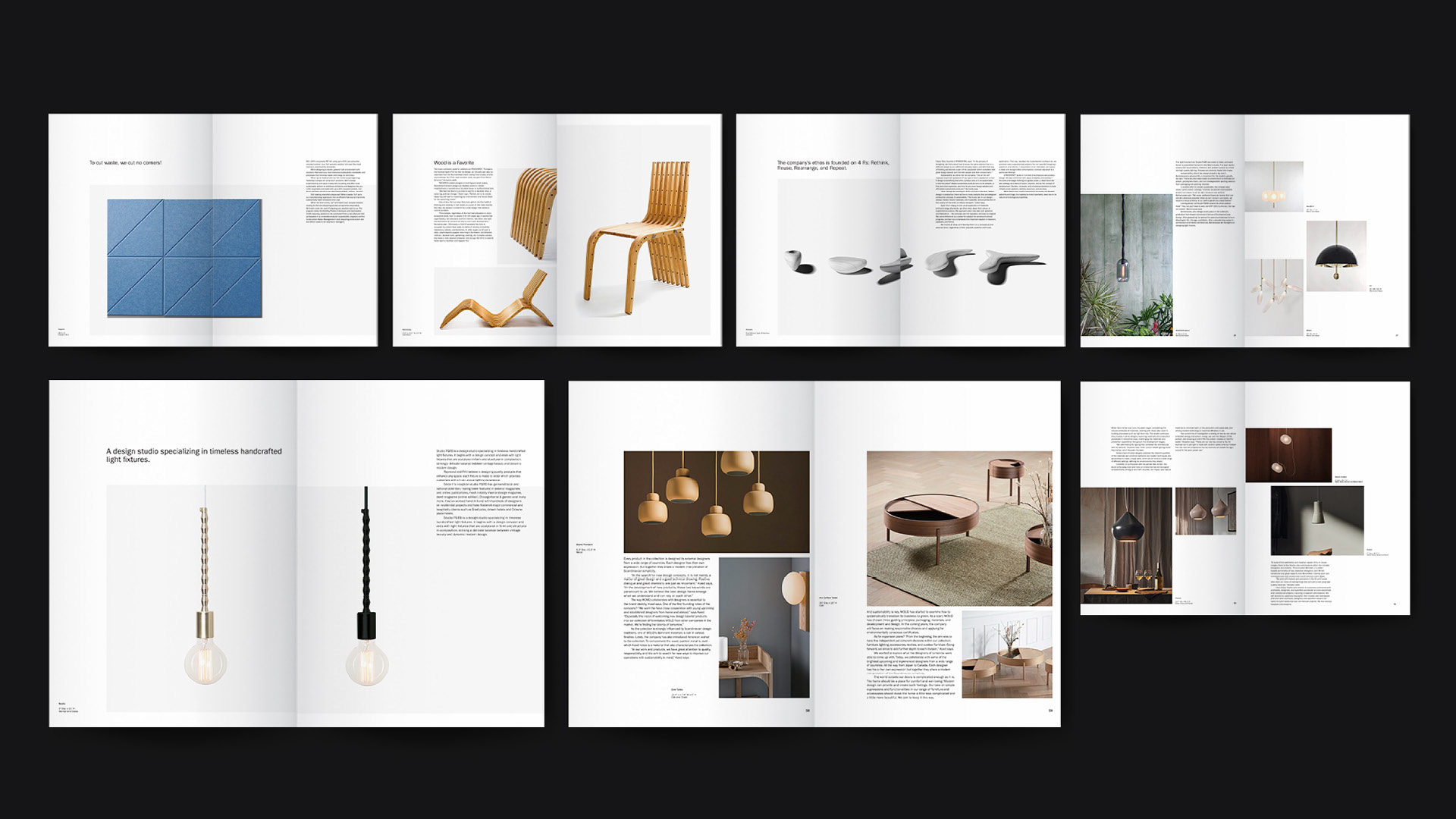
" To showcase the high-end and sustainability of the furniture, the magazine takes the form of a newspaper. The rough paper brings a natural feel and a different experience from ordinary magazines. "
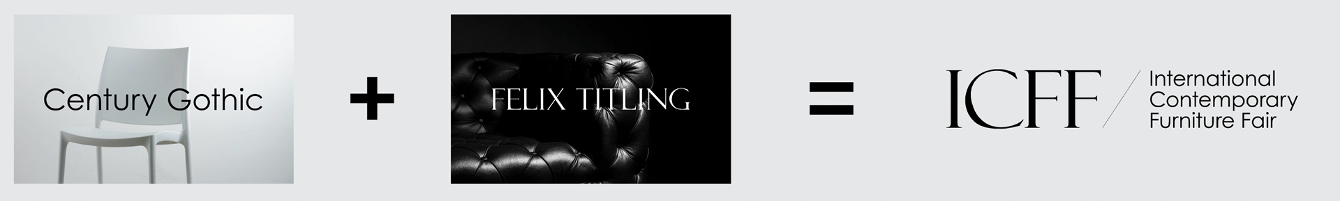
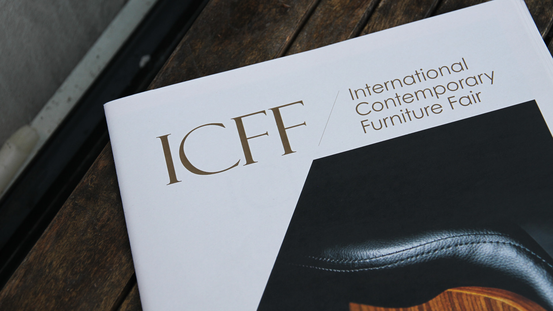
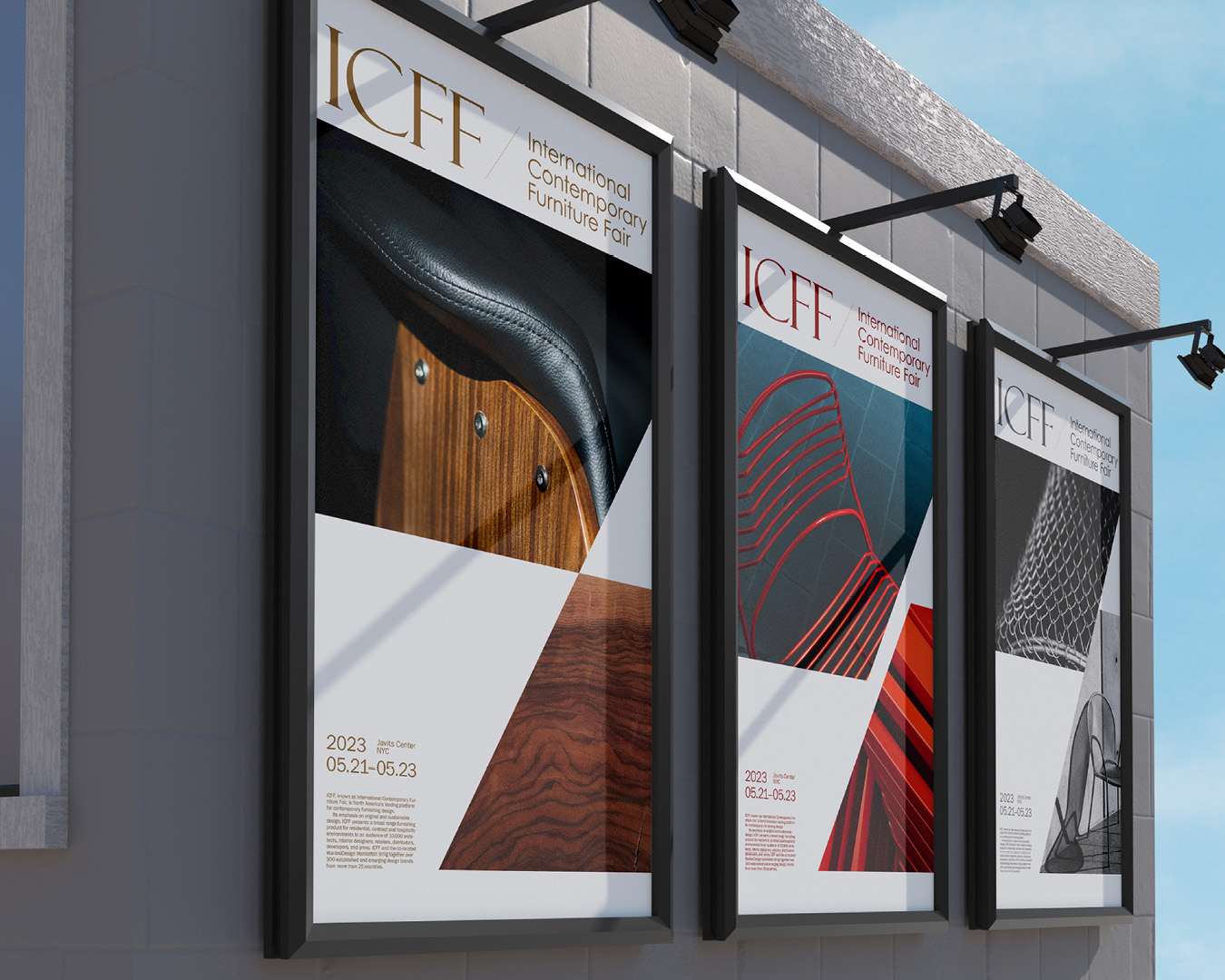
" The logotype is designed by typefaces Felix Titling and Century Gothic with a slash between them. The combination of these two fonts expresses the modern and elegant character of the furniture. "
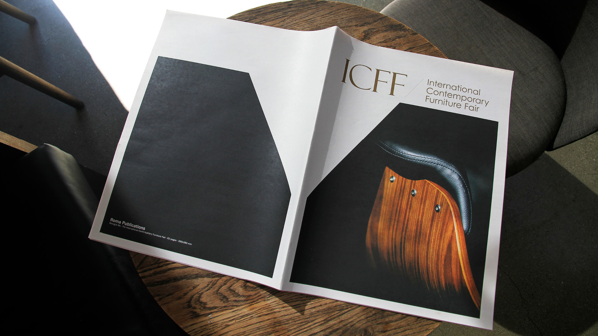
" The magazine cover extends the linear elements of the logotype into graphic forms, using them as key visual elements. Close-up details of furniture highlight materiality and craftsmanship. "
© 2026 Shengjie Wu. All Rights Reserved.