Zebulon Rebrand

Brand Identity, Strategy, Web Design, Animation, Wayfinding Design
Full Version of Style Guide
Design by
Shengjie Wu
Zebulon Café Concert, known as Zebulon, is a venue for food, music, and live performances located in Los Angeles. It features night performances by local and international performers.

The goal of redesigning the identity is to build an easy-to-manage branding system to connect brand activities and events. The goal of redesign also shows the diversity and the enthusiastic persona of Zebulon to customers.
Logomark

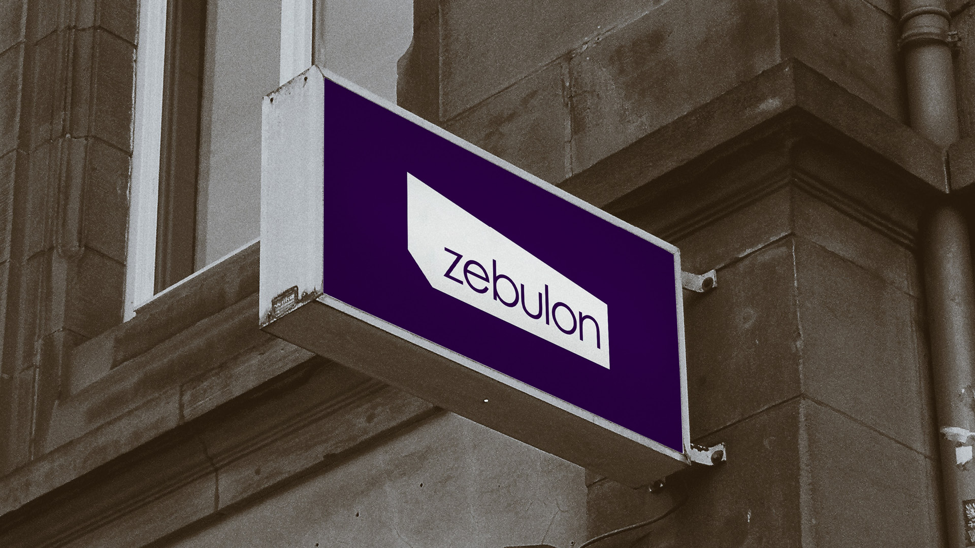
Zebulon is not only a music bar, but also a public venue featuring many different events and shows for audiences to enjoy. I used the geometric shape of the stage to represent the stage concept. Zebulon not only includes stage performances but also includes dance, live talks, and film events. I designed different geometric logos for different events by changing the stage concept logo.

Marketing Materials

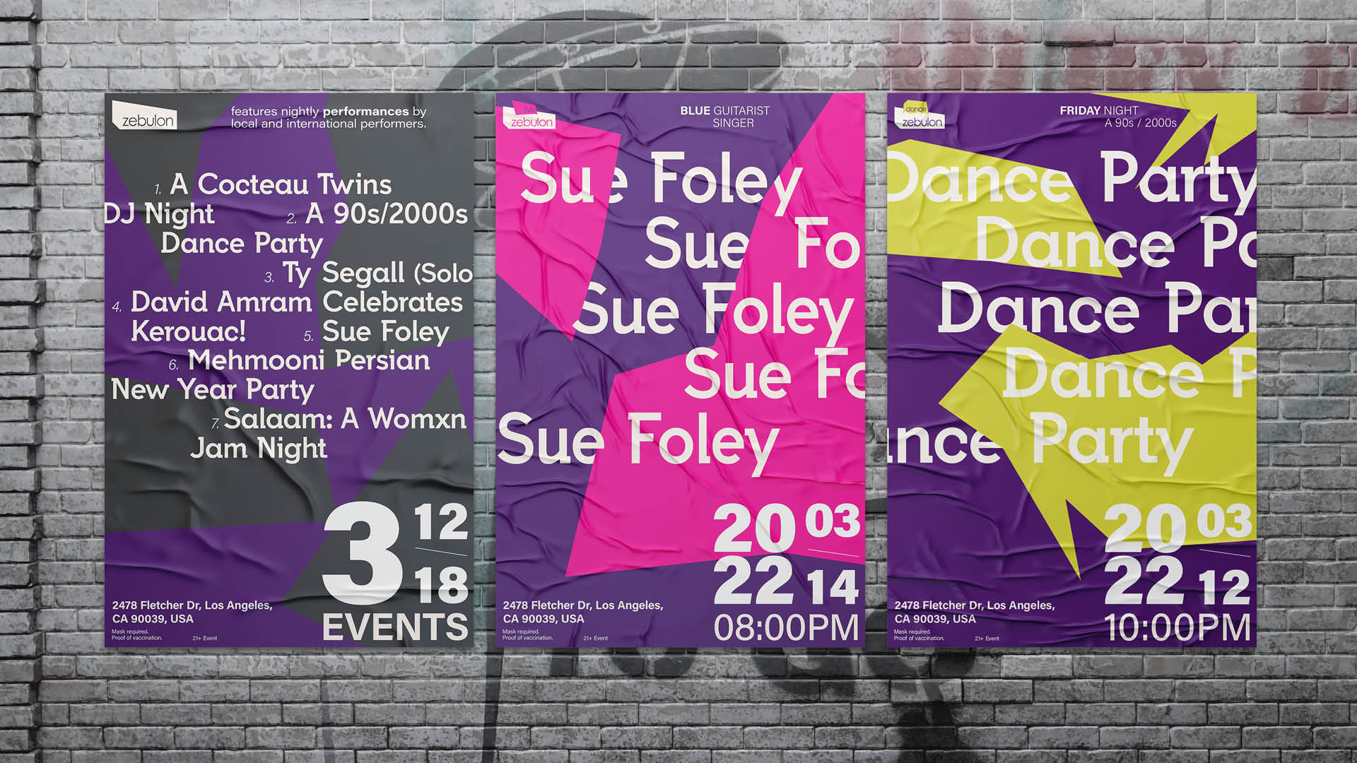
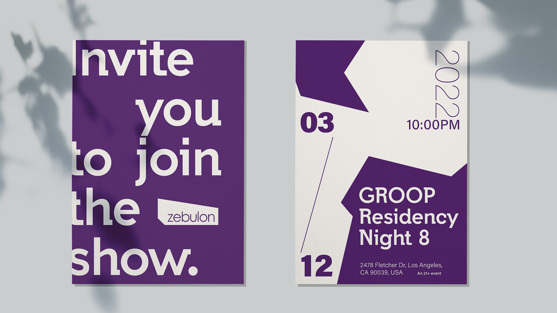
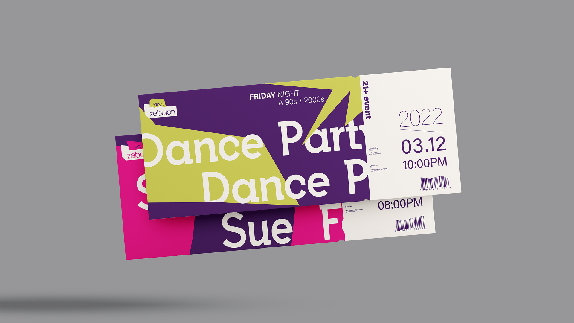
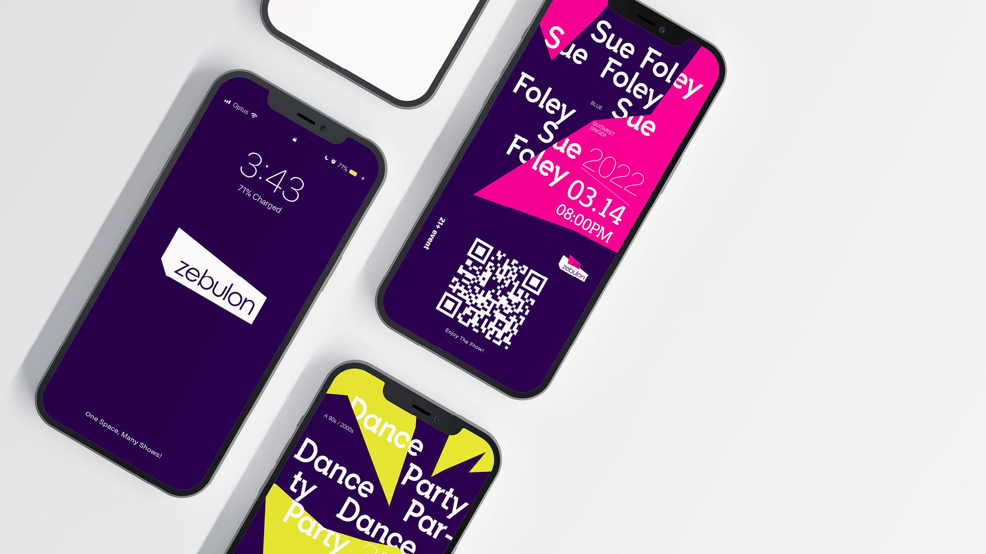
Geometry Icons and patterns present a stronger brand style and identity. Icons and patterns could be used on different applications and media such as posters, tickets, invitations, etc.

Digital Media

To allow customers to access performance and event information faster and more directly, I used a lot of negative space to make the main information easier to access. I also used the brand’s purple color and logo elements to maintain brand consistency.

Way-finding

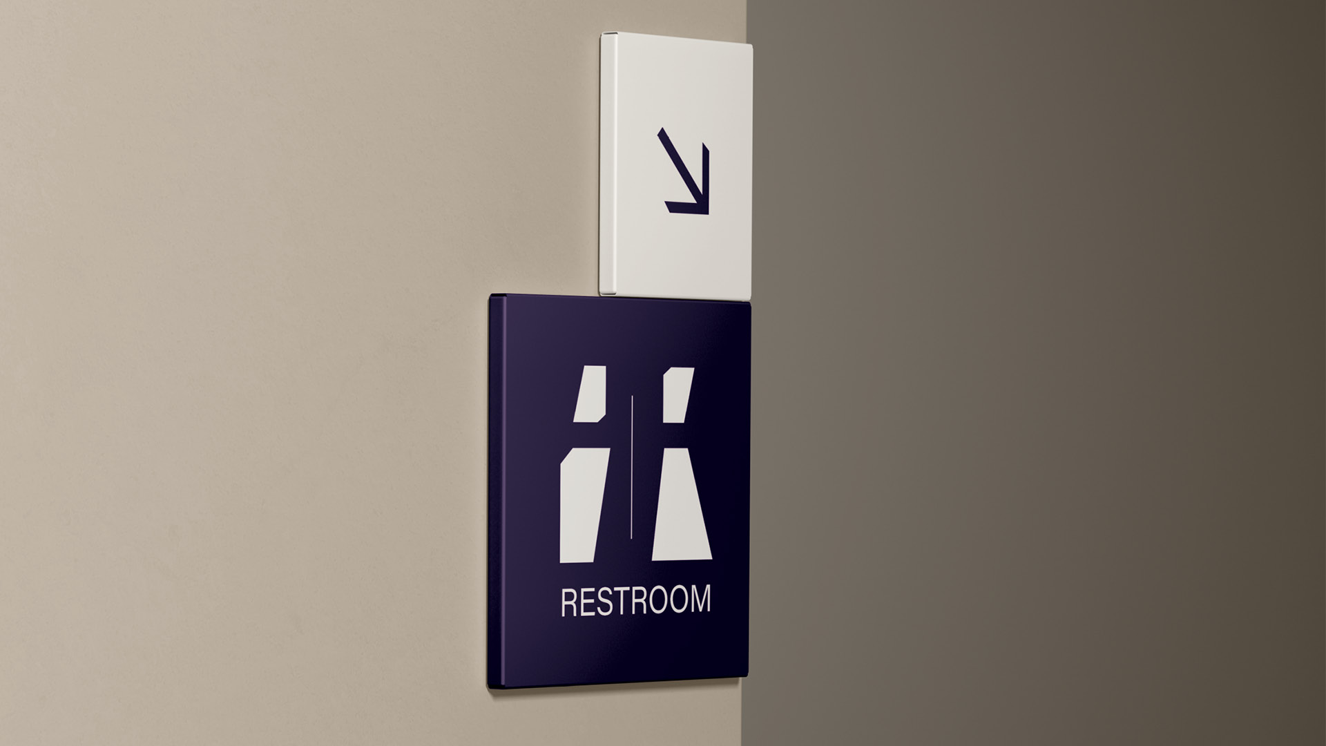
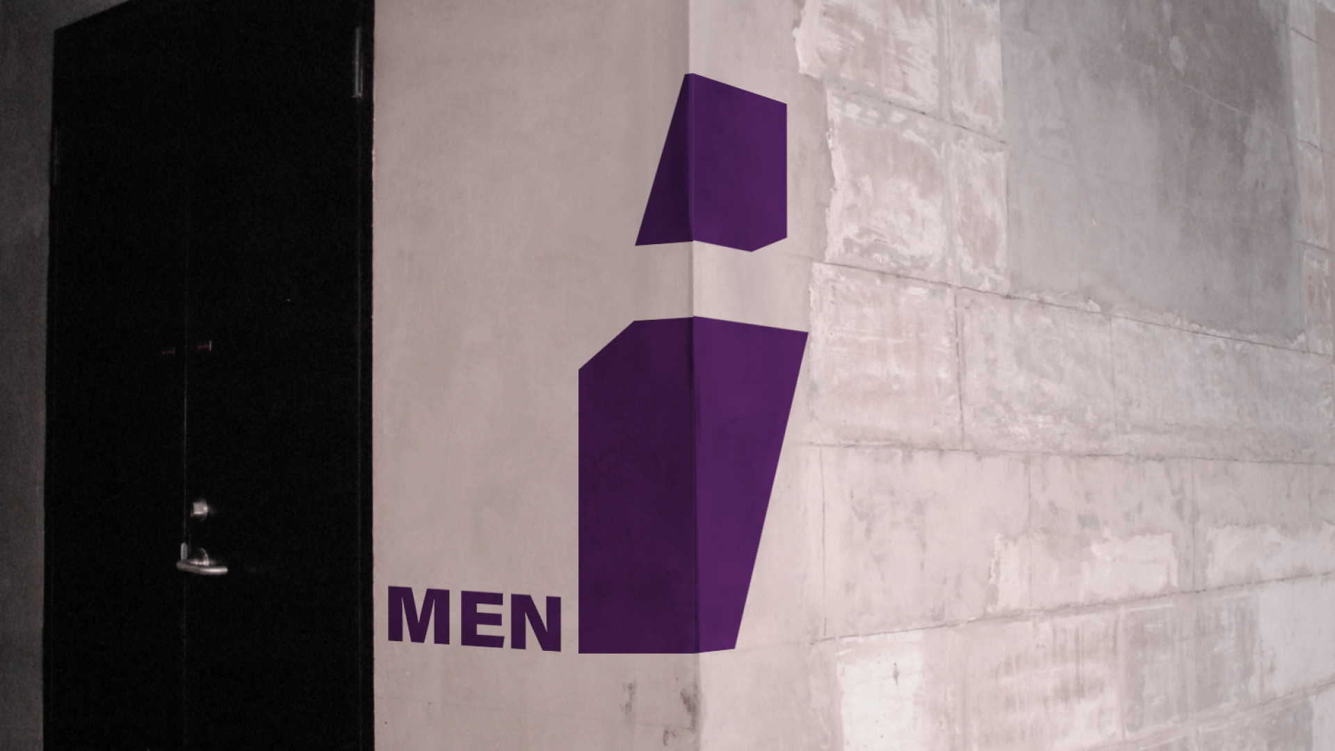
I constructed and deconstructed the logo’s geometry to create new patterns for wayfinding. At the same time, through the use of brand colors and the same visual elements, the visual elements of the wayfinding system will be consistent with the identity system.

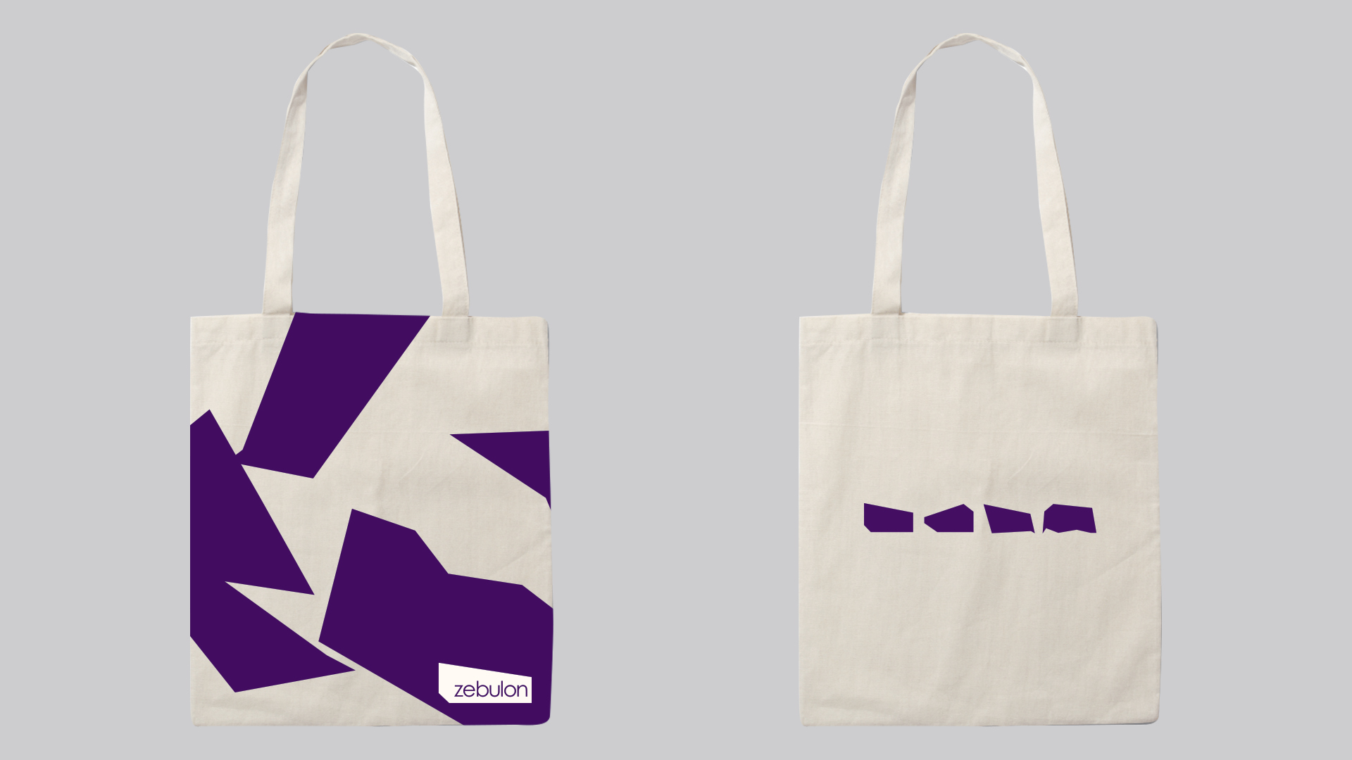
Promotional Items

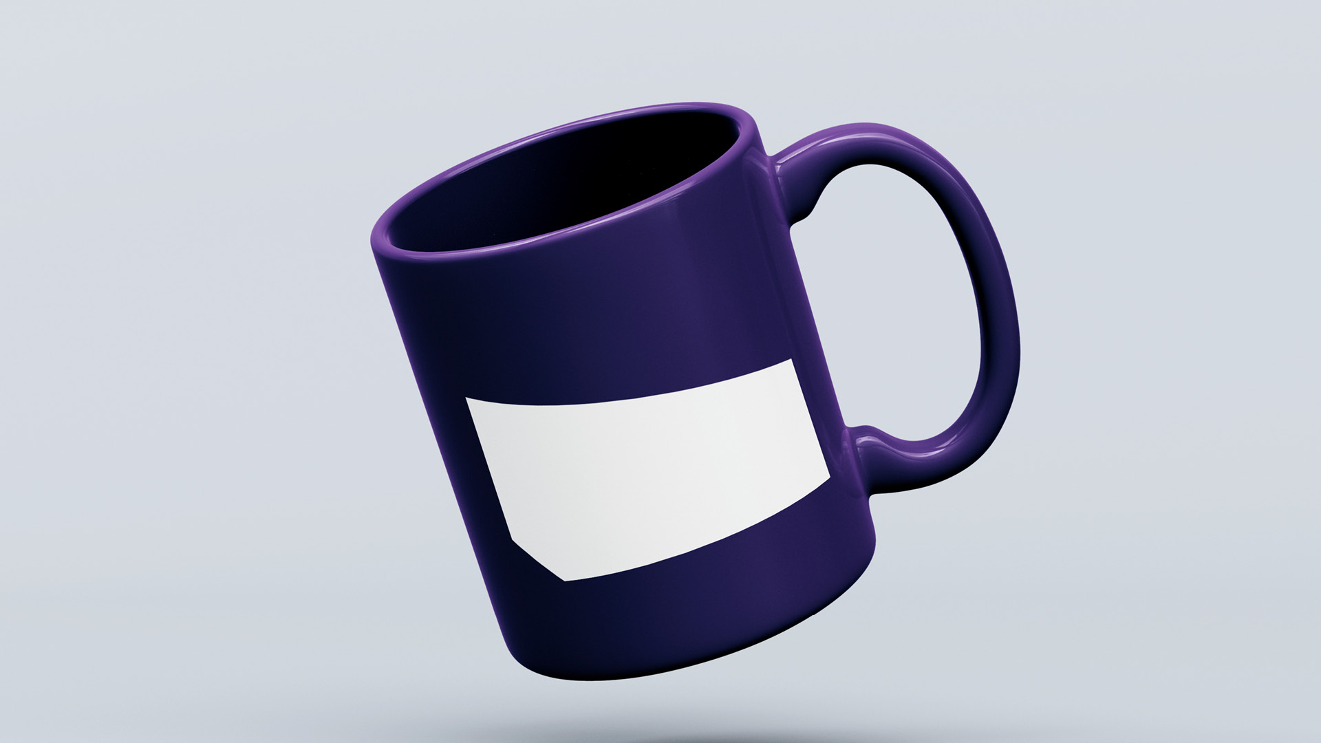
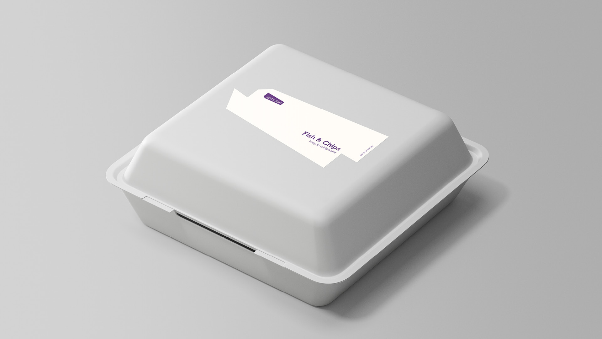
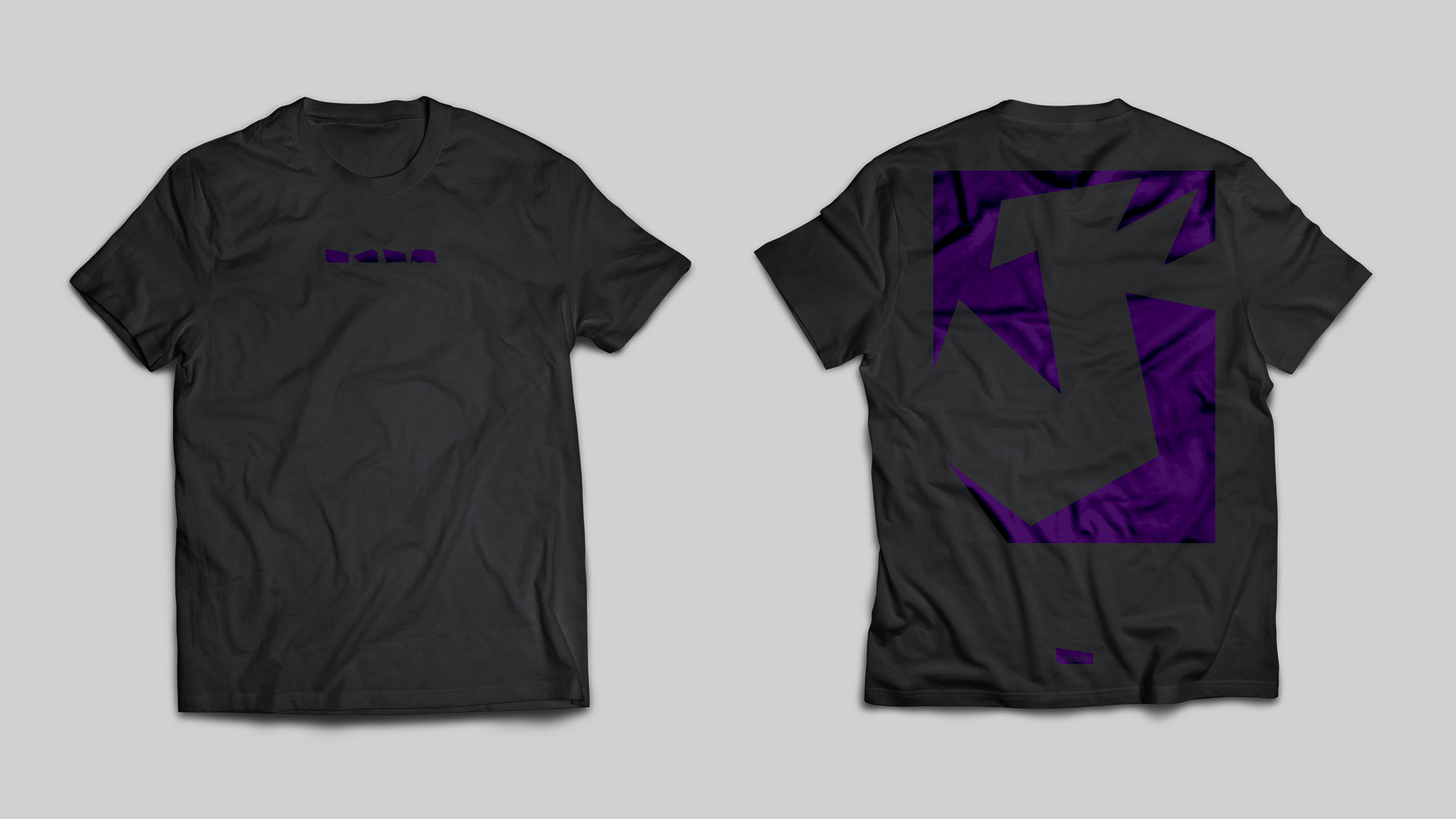
I used the geometry shape of the stage to create a series of promotional items to help the brand promote itself to the public.

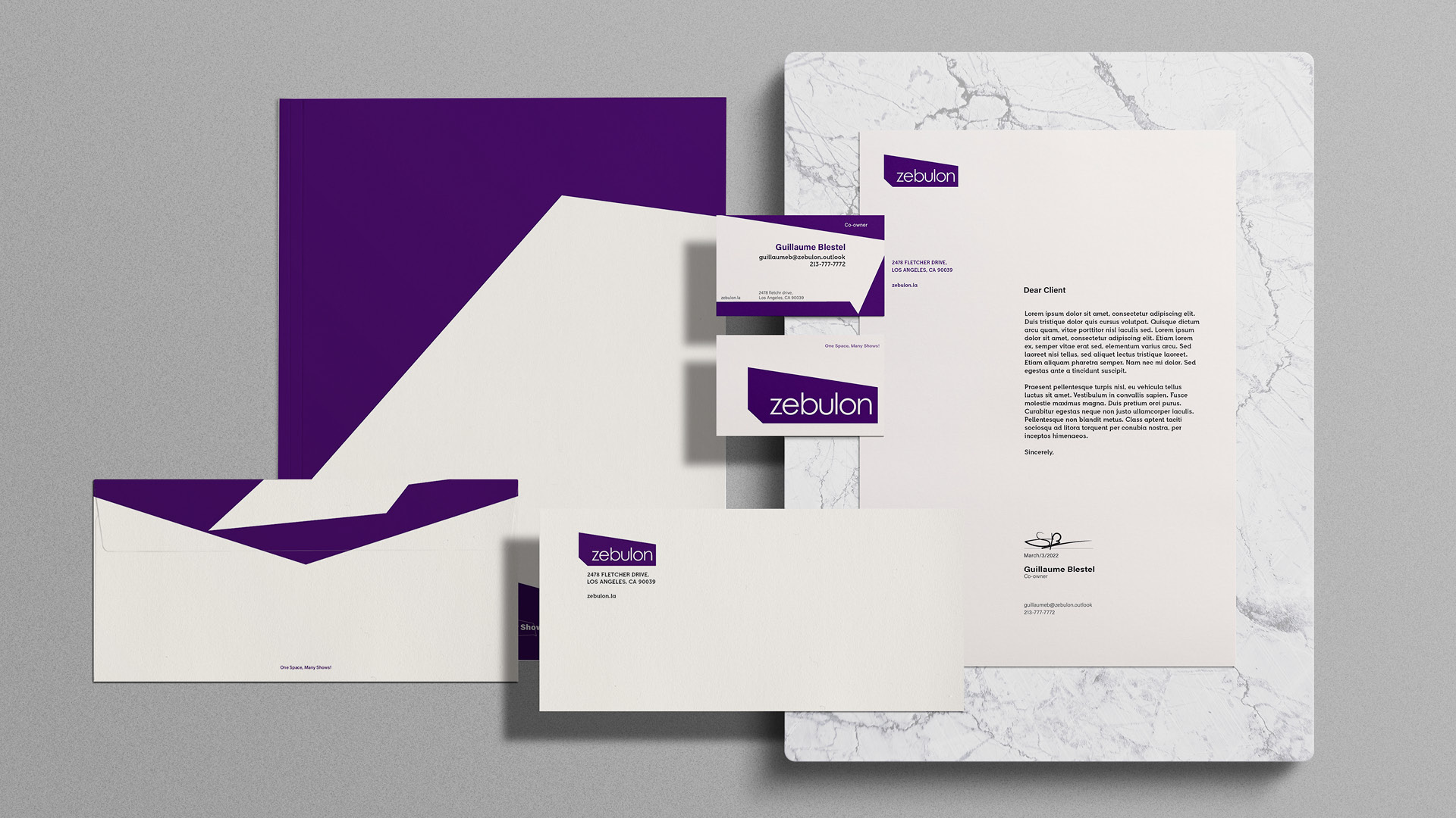
Stationery

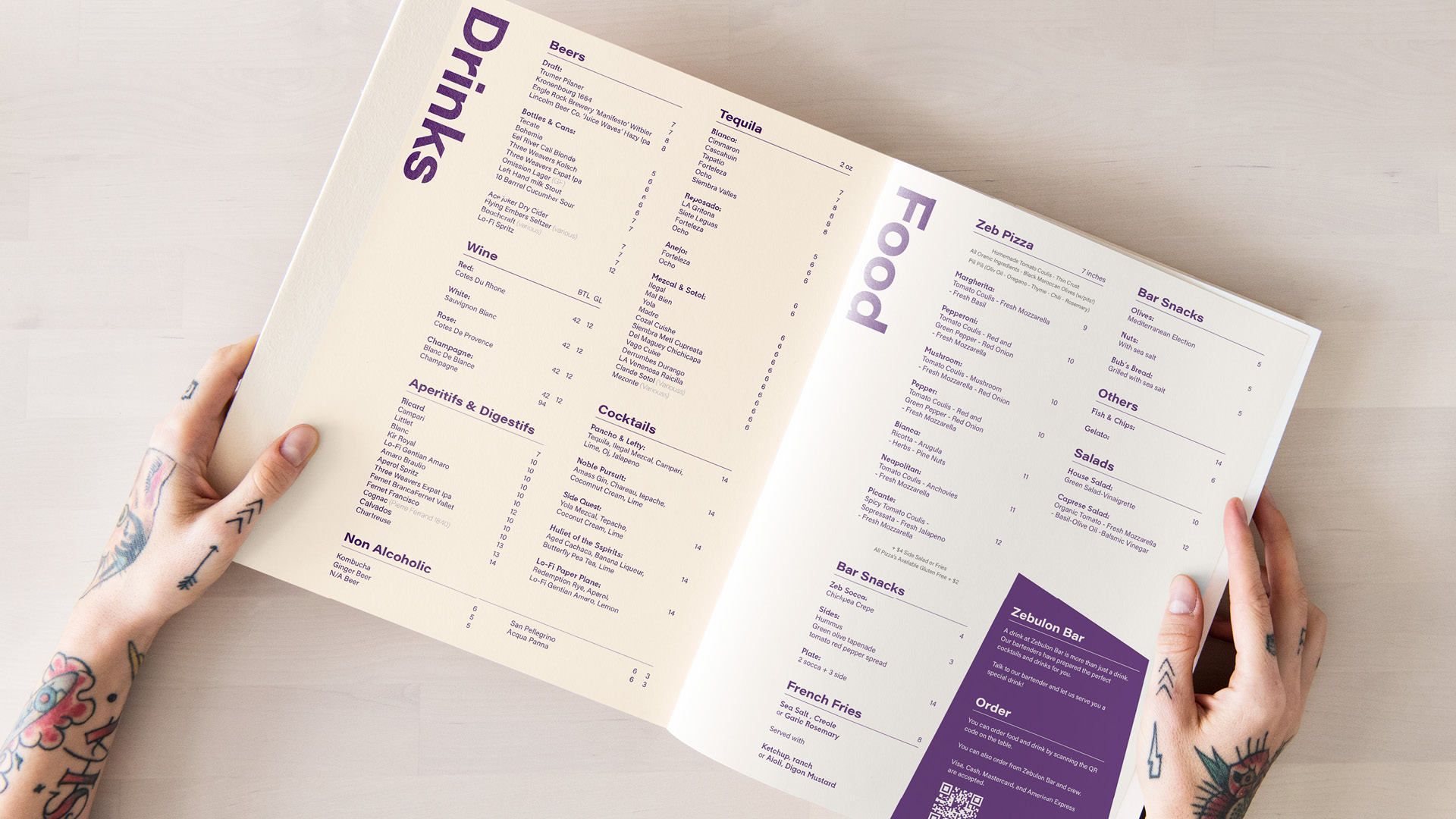
I created a set of stationery that maintains a consistent brand identity by using the brand’s geometric elements.