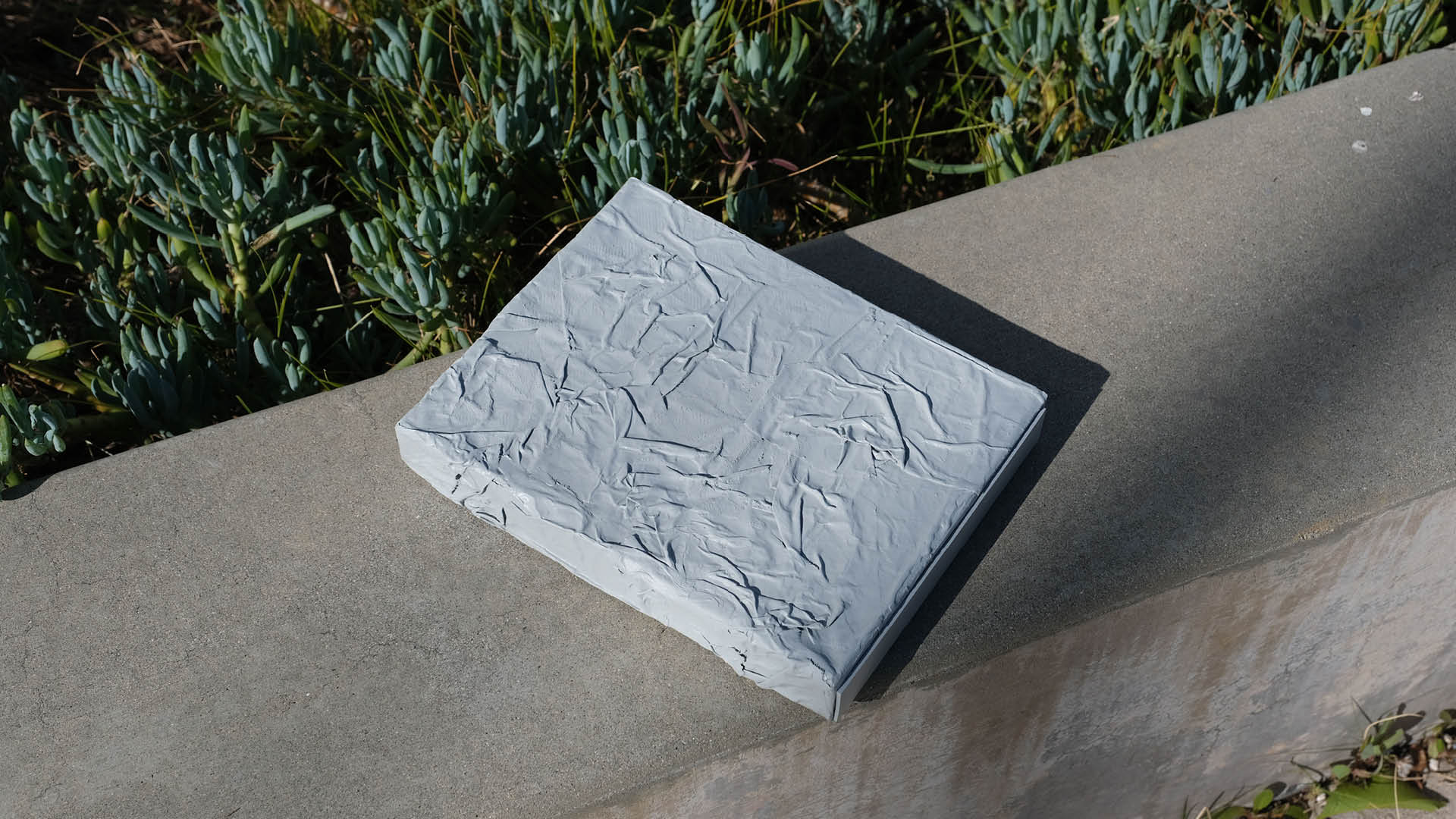
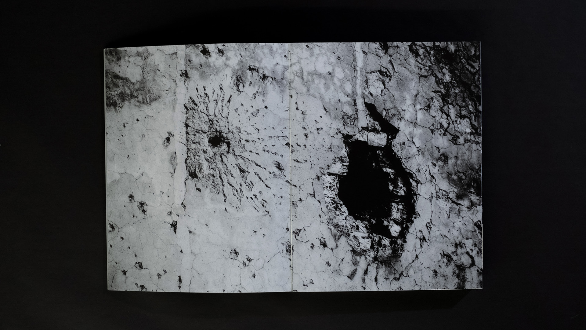
The use of raw materials, such as concrete, is the defining feature of Brutalist architecture. Its honesty, raw beauty, and boldness produce architecture with a soul that speaks directly to people's hearts. To reflect the beauty of raw materials, a textured shell was constructed using white glue and newspaper, then spray-painted to resemble raw concrete.
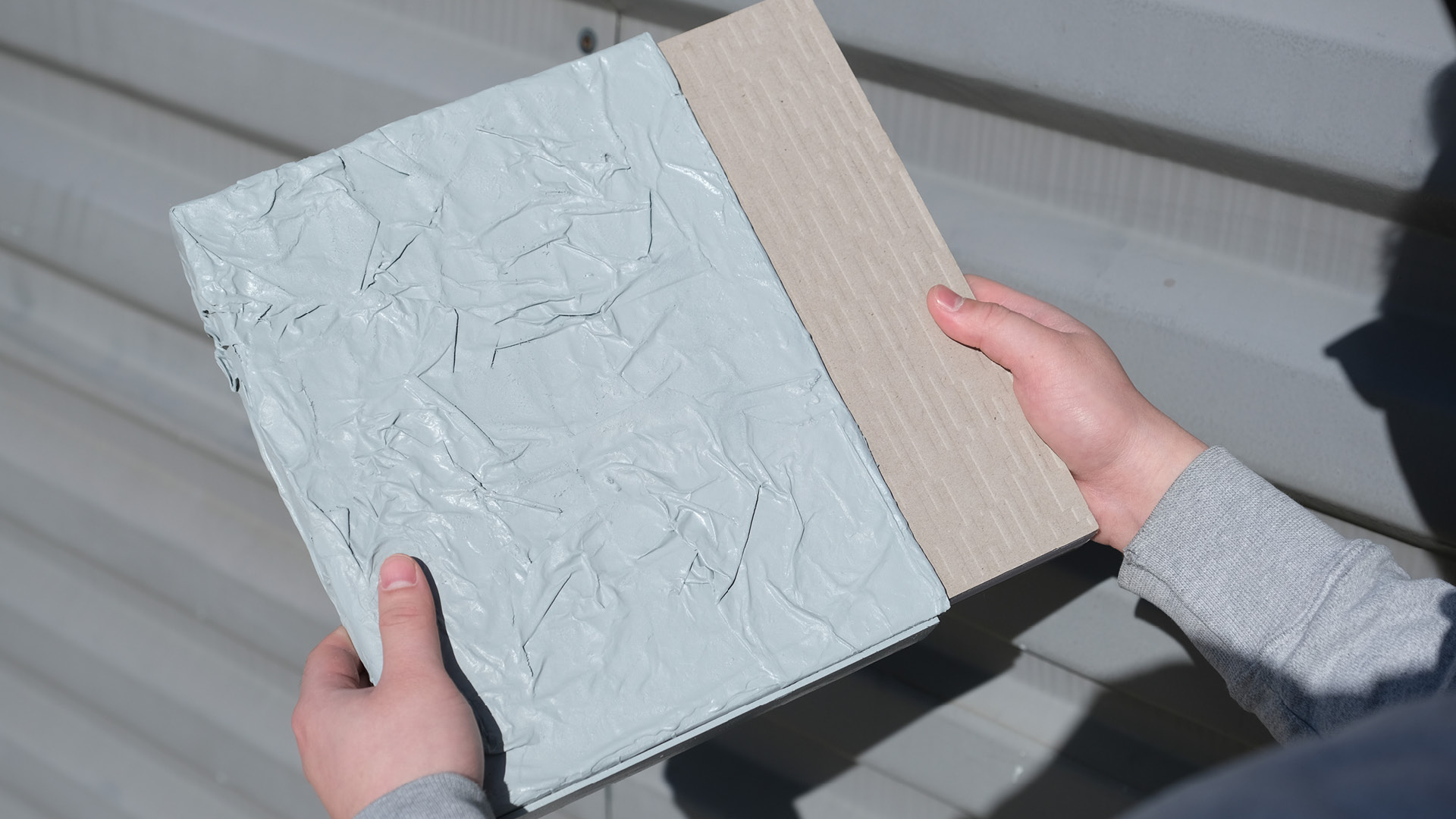
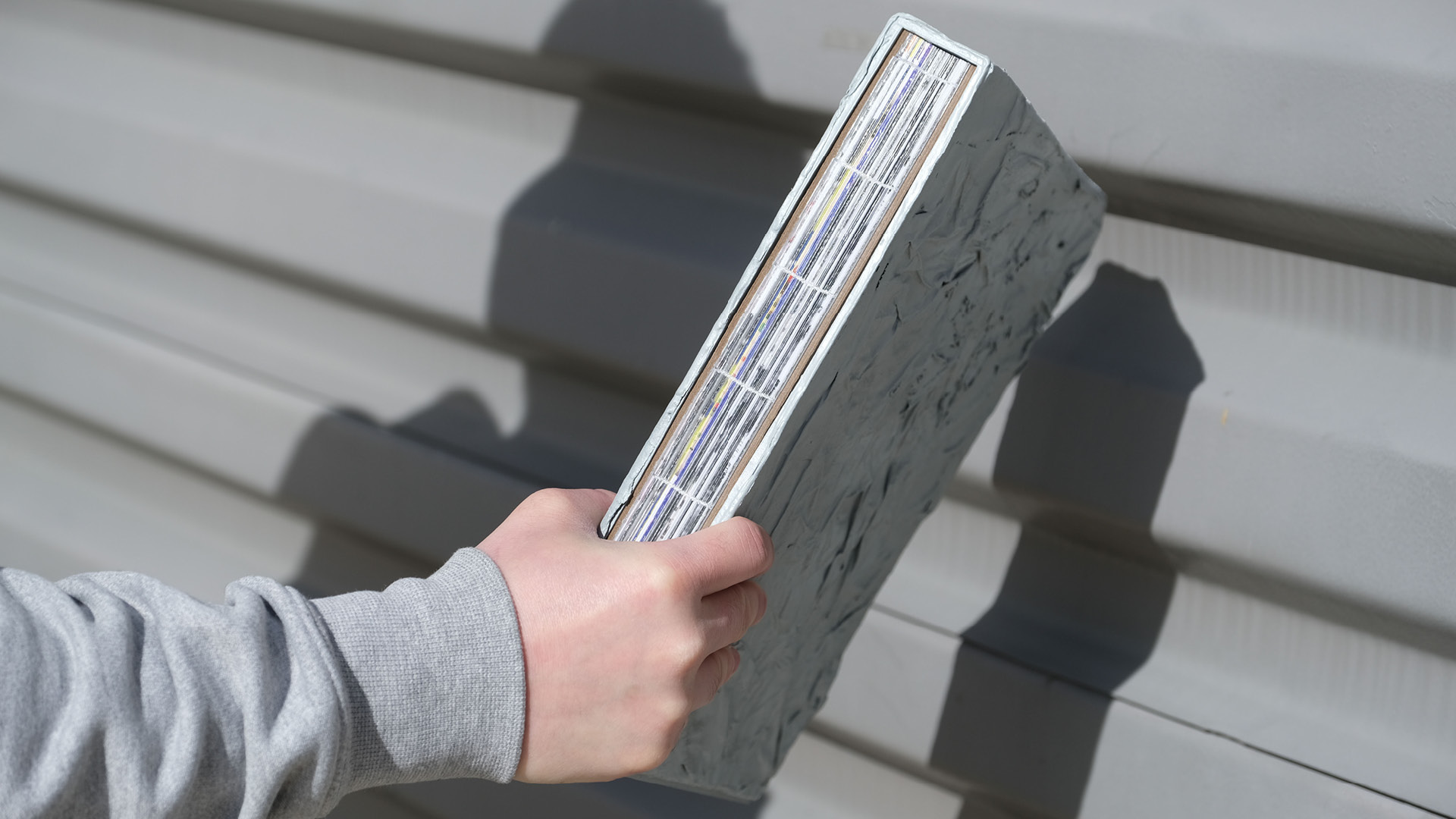
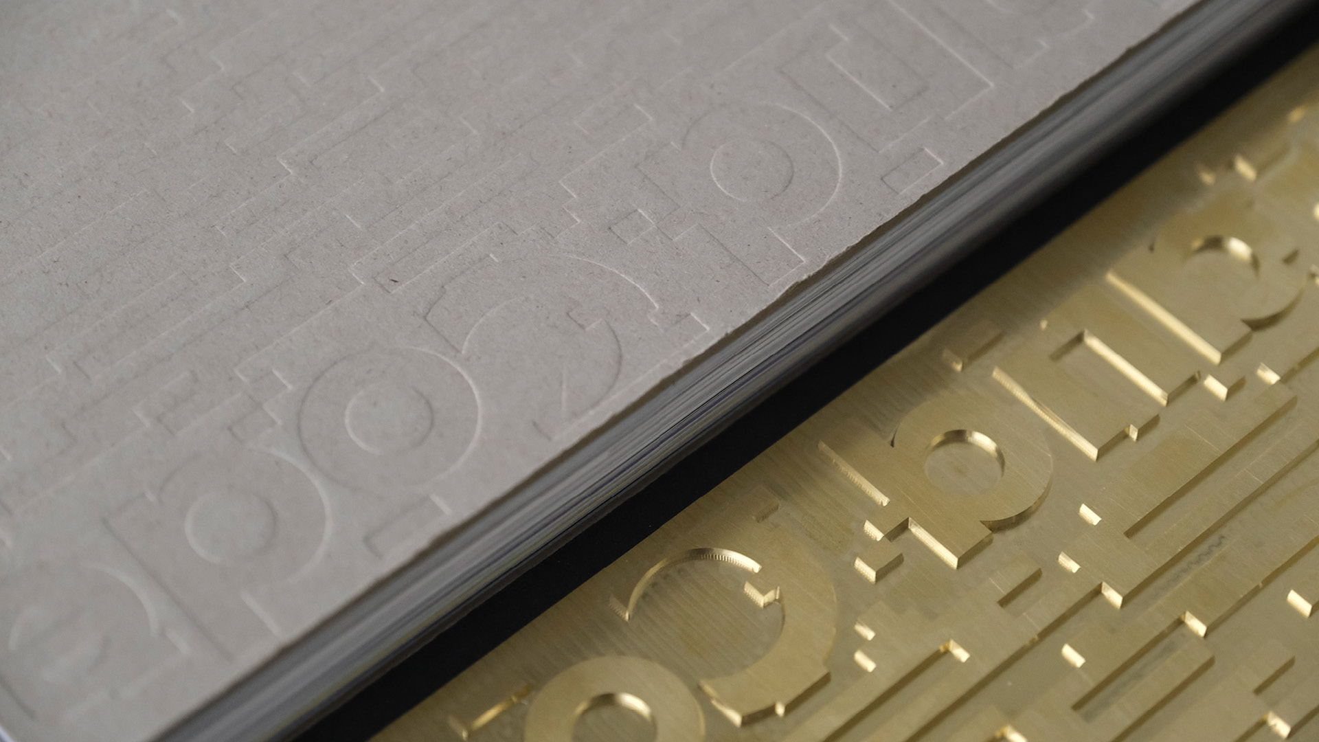
The cover is made of unaltered cardboard. Embossing creates a rough, concrete-like texture. The exposed binding further reinforces the idea of raw, unrefined materiality.
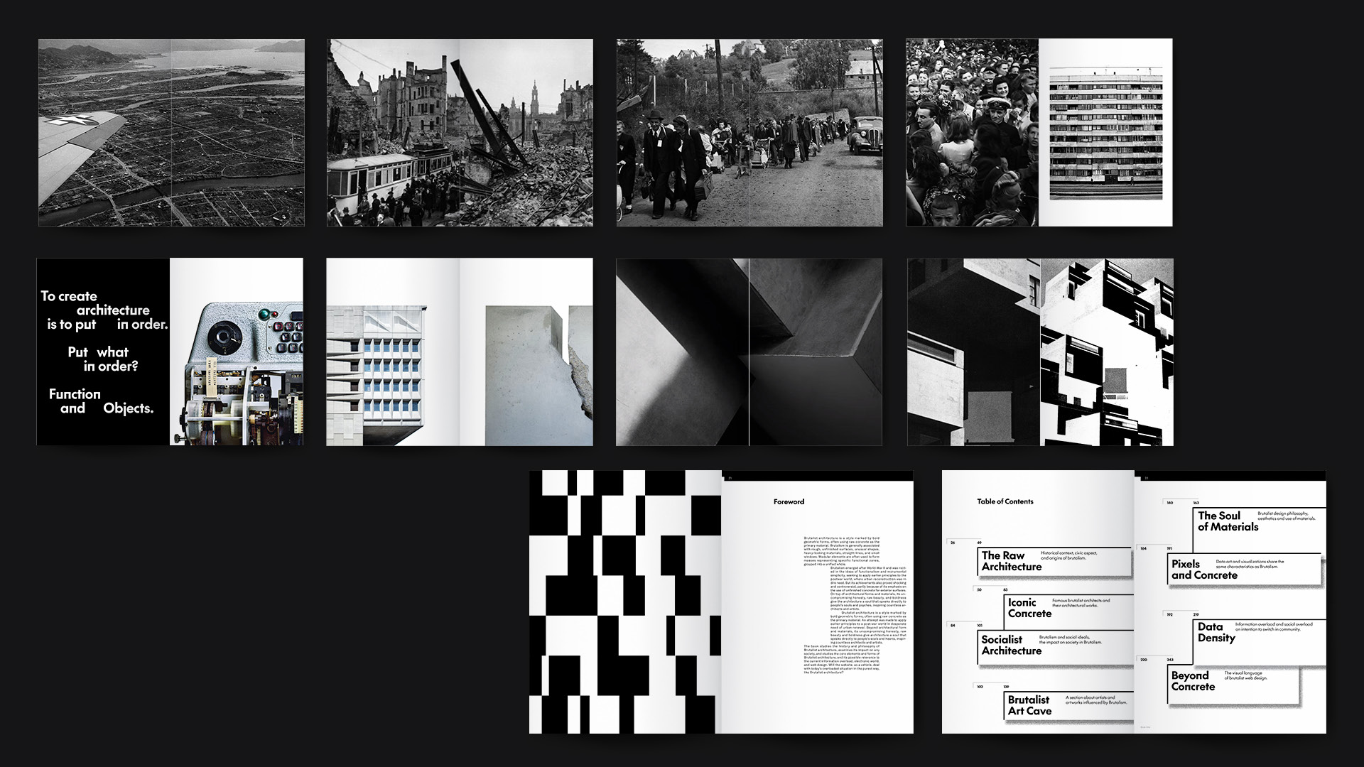
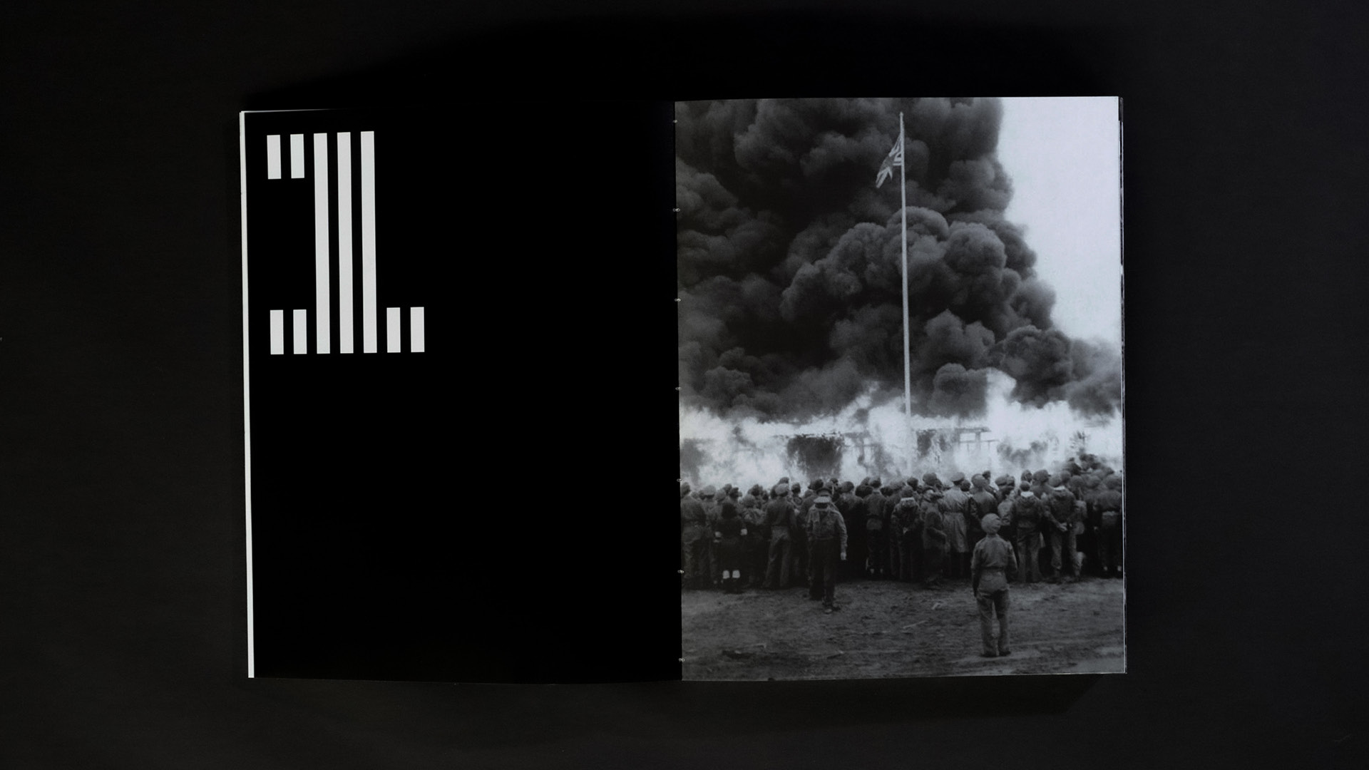
The intro section emphasizes the reasons for the emergence of Brutalism by telling the story of the post-war world. The ruined streets, people’s lives after the war, and the form the brutalist architecture.
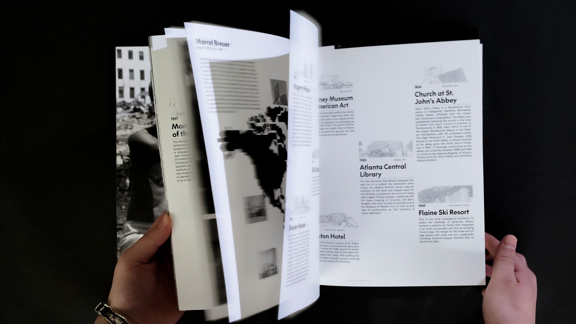
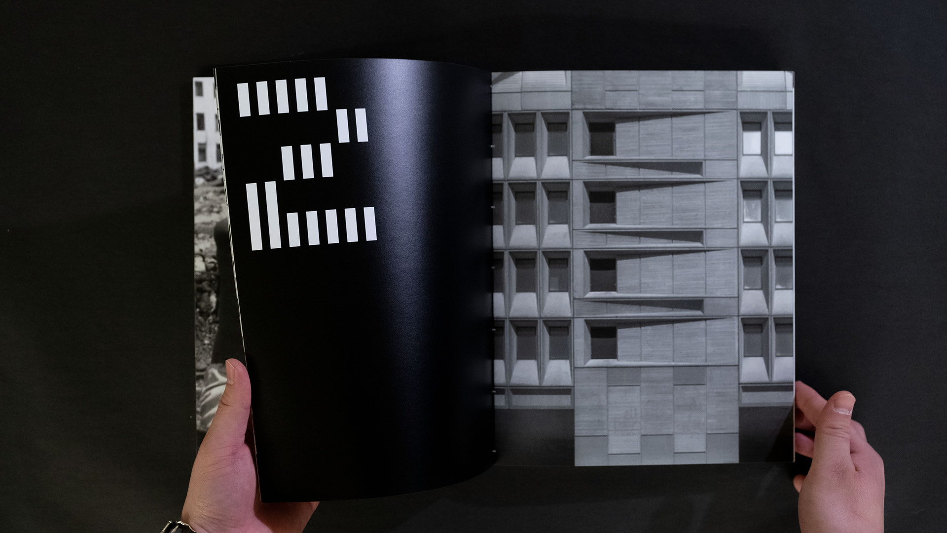
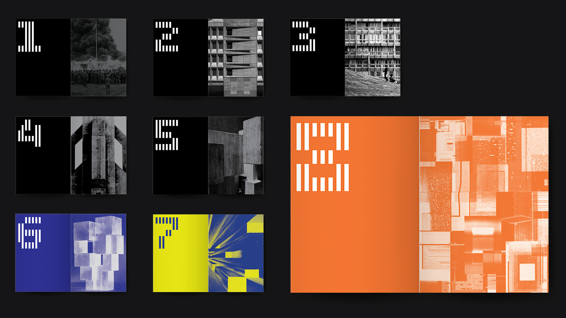
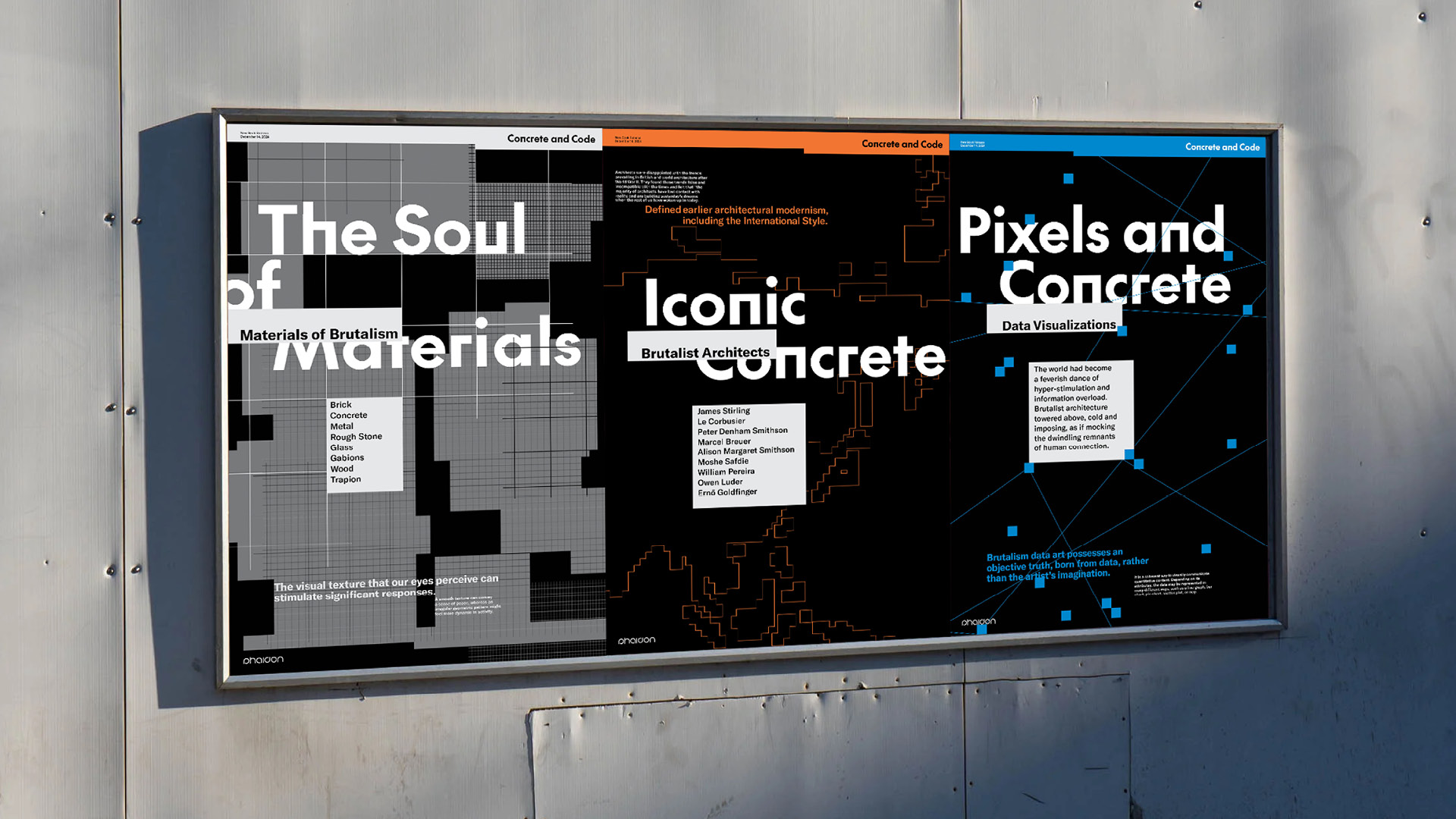
The modular typeface, numbers, are inspired by Brutalist forms. The original geometric shapes represent an honest and pure expression of Brutalist architecture.
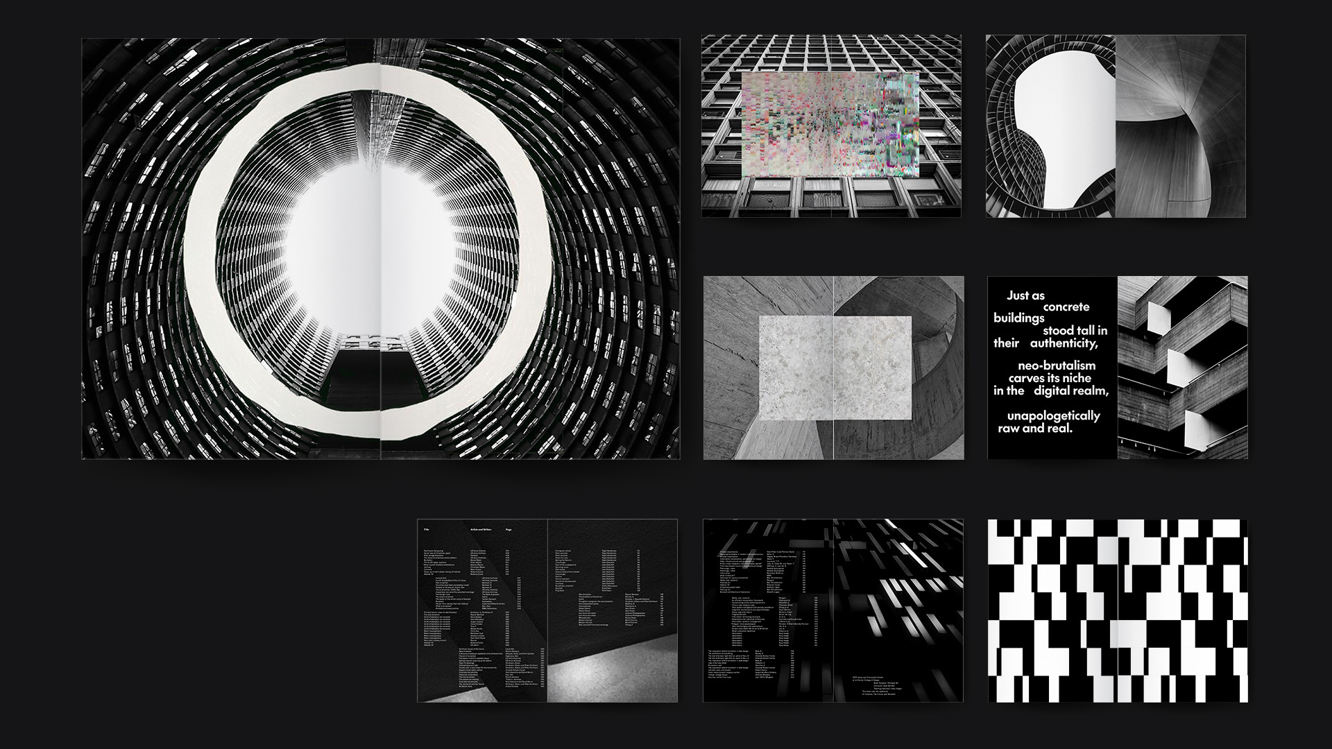
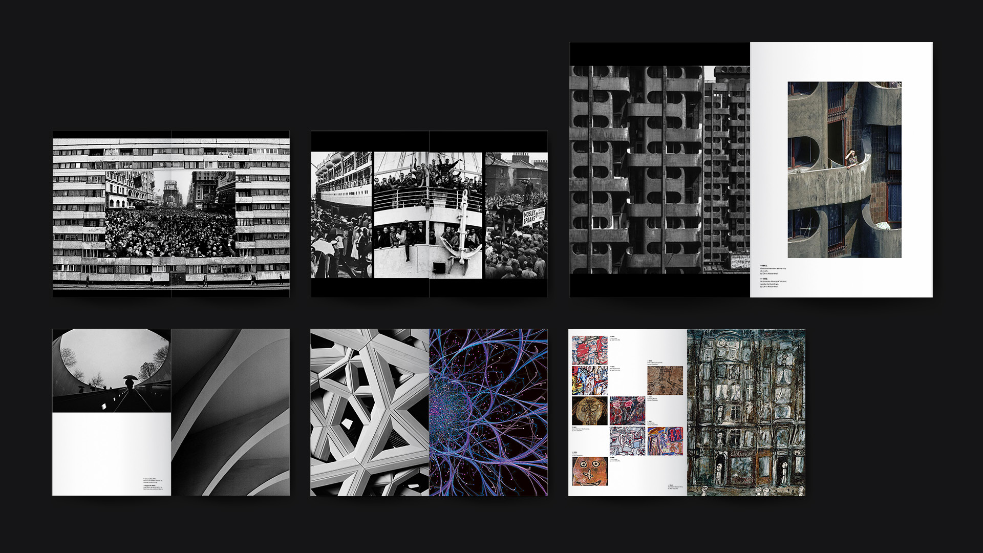
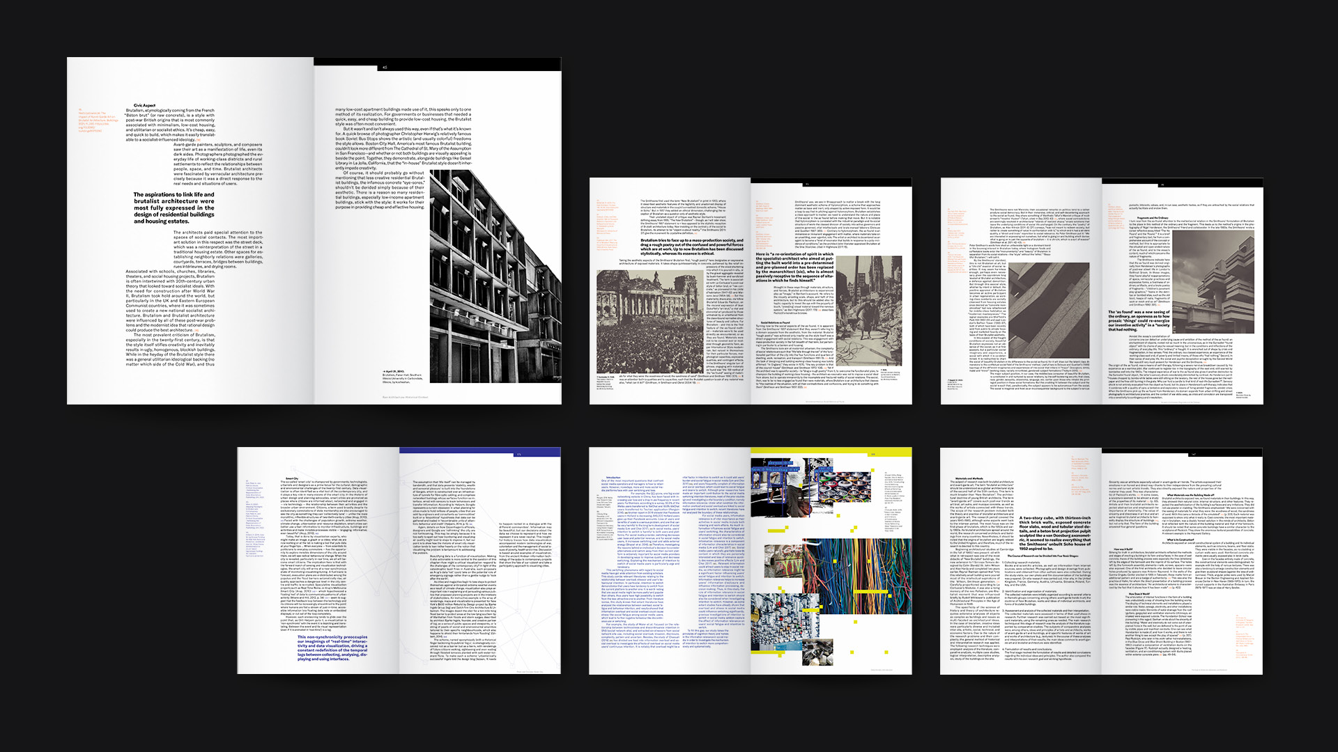
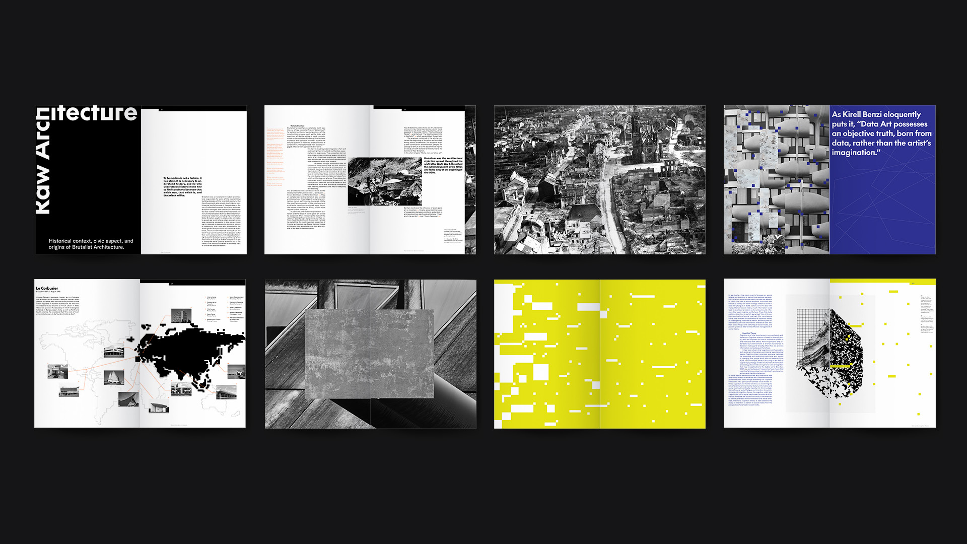
The book tells stories through photography, using black-and-white images to reflect a post-war world. As it moves into digital technology and Brutalism’s influence on artists, color images gradually appear, marking a shift in tone and era.
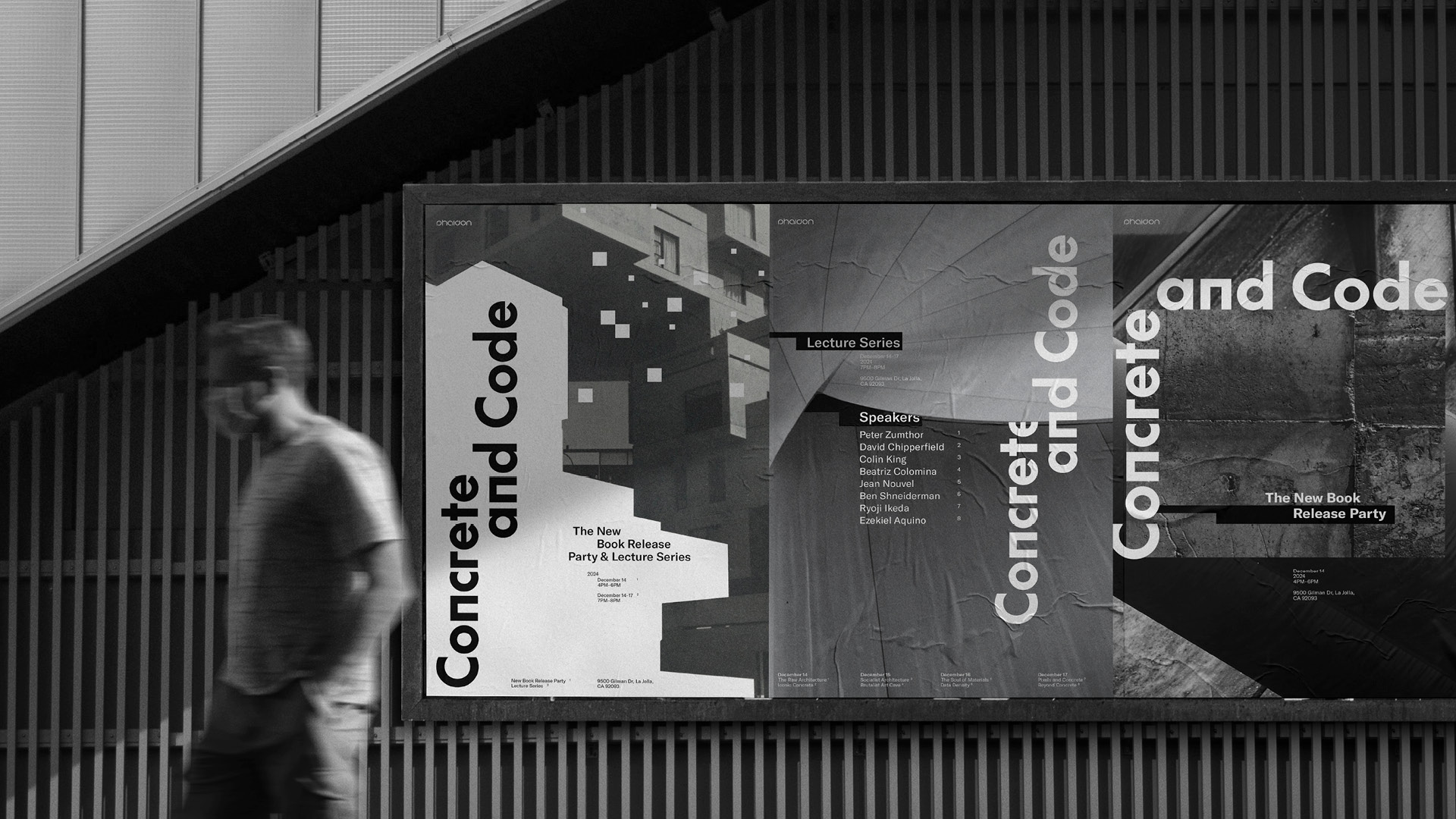
Concepts of geometric shapes and raw textures are used throughout the visual in the form of typography, imagery, and geometric graphic elements.
Art Director: Shengjie Wu
Designer: Shengjie Wu
Photographer: Chia-Yu Liu
Videographer: Chia-Yu Liu
Video Editor: Shengjie Wu
Communication Arts – 2025 Typography Shortlist
Communication Arts – 2024 Design Shortlist
Young Ones – 2024 TDC Shortlist
© 2026 Shengjie Wu. All Rights Reserved.