
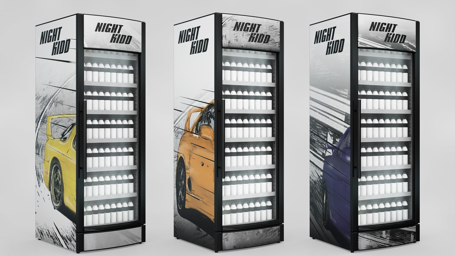
" The logo is inspired by the feeling of high-speed driving. The logotype is tilted and the “K” is given sharper angles to visually express speed, energy, and passion, reflecting the dynamic spirit of the packaging. "
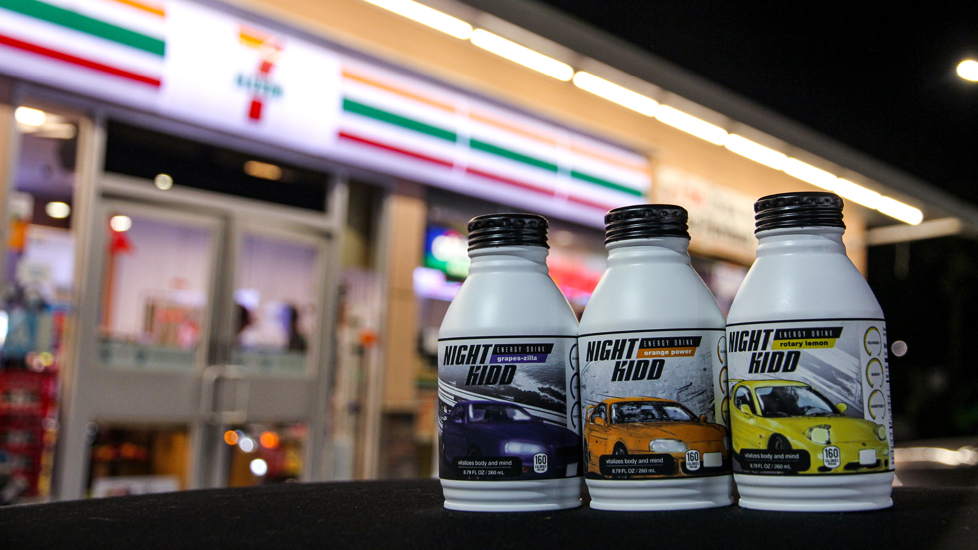
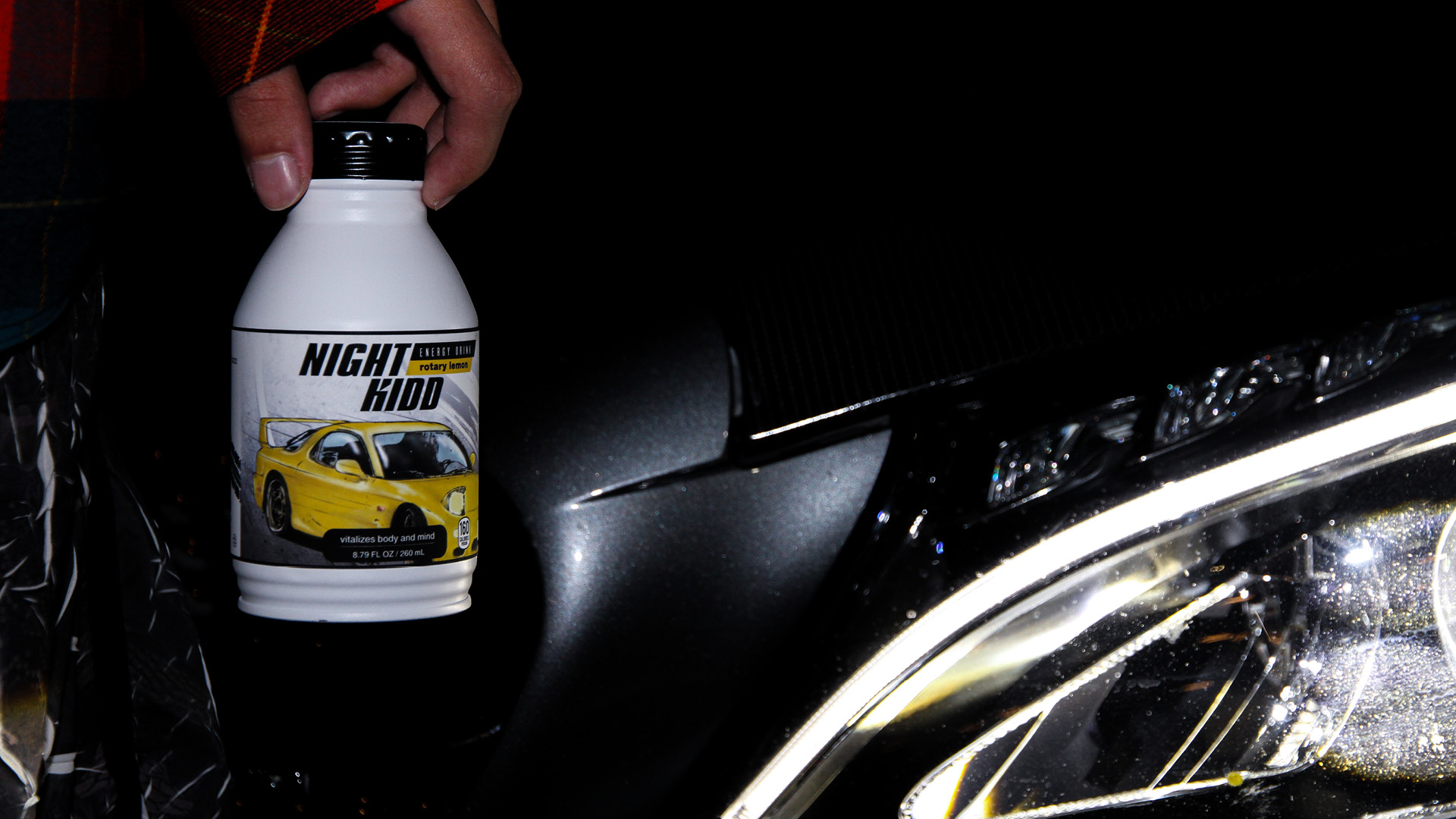
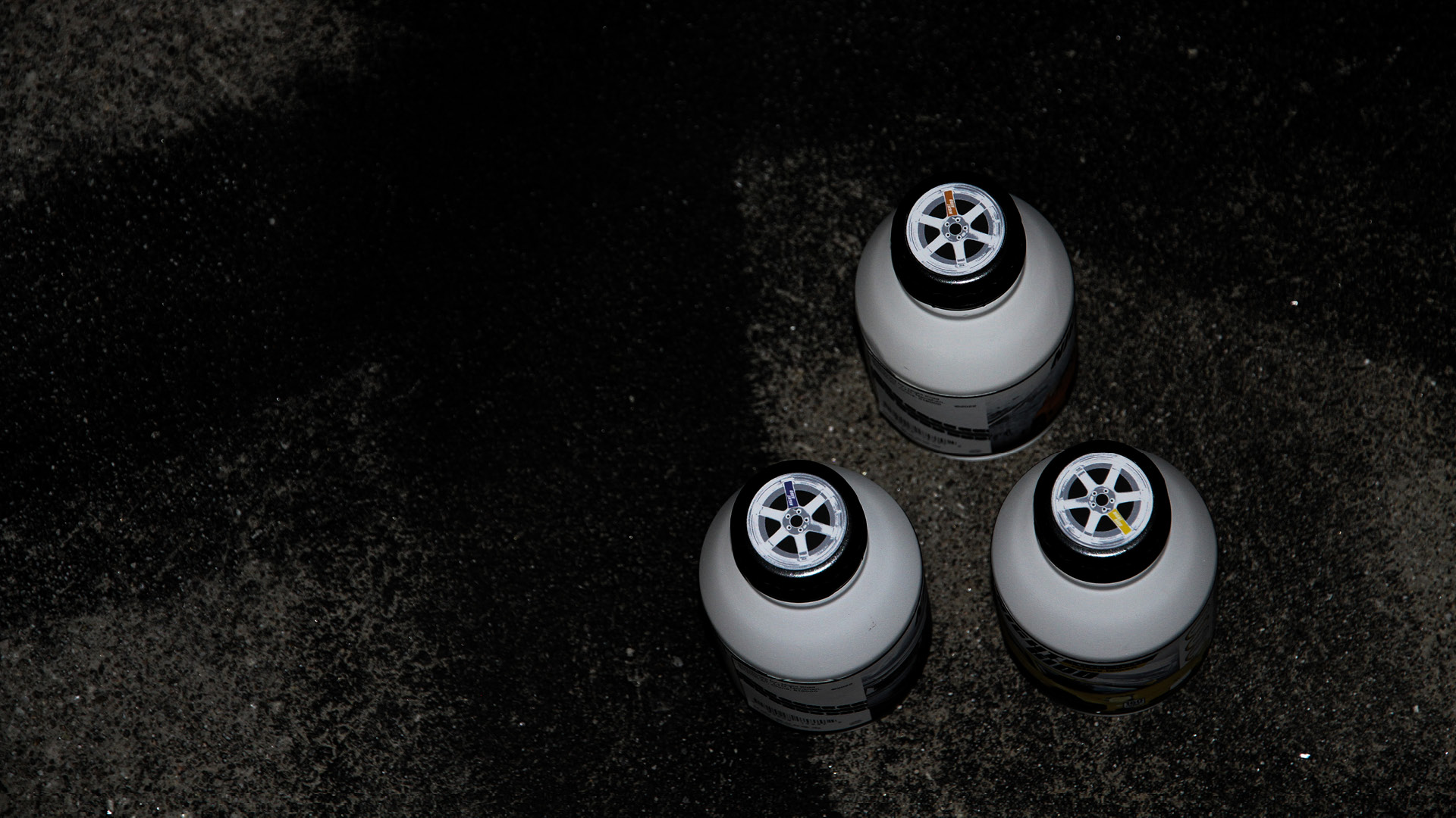
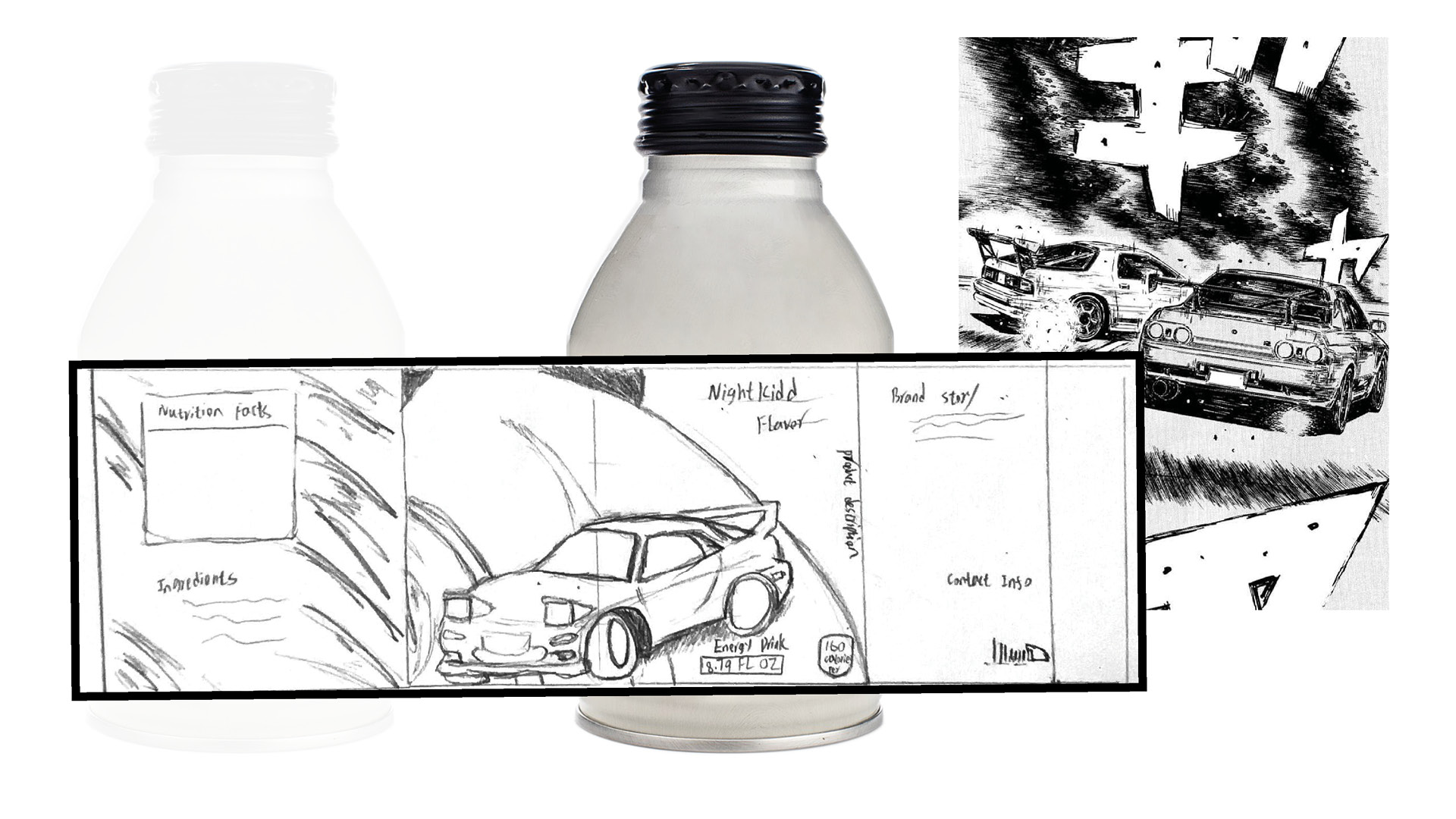
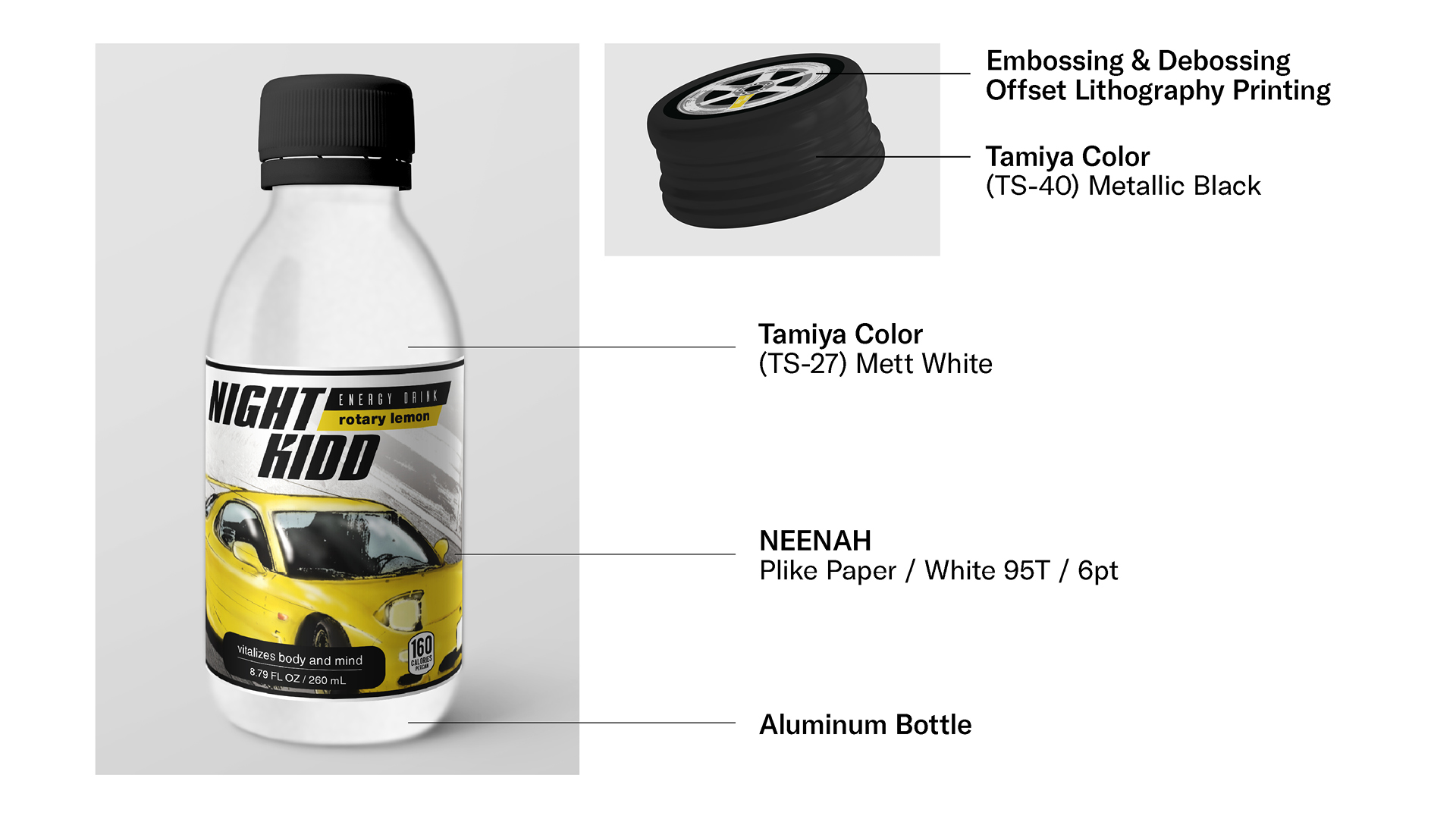
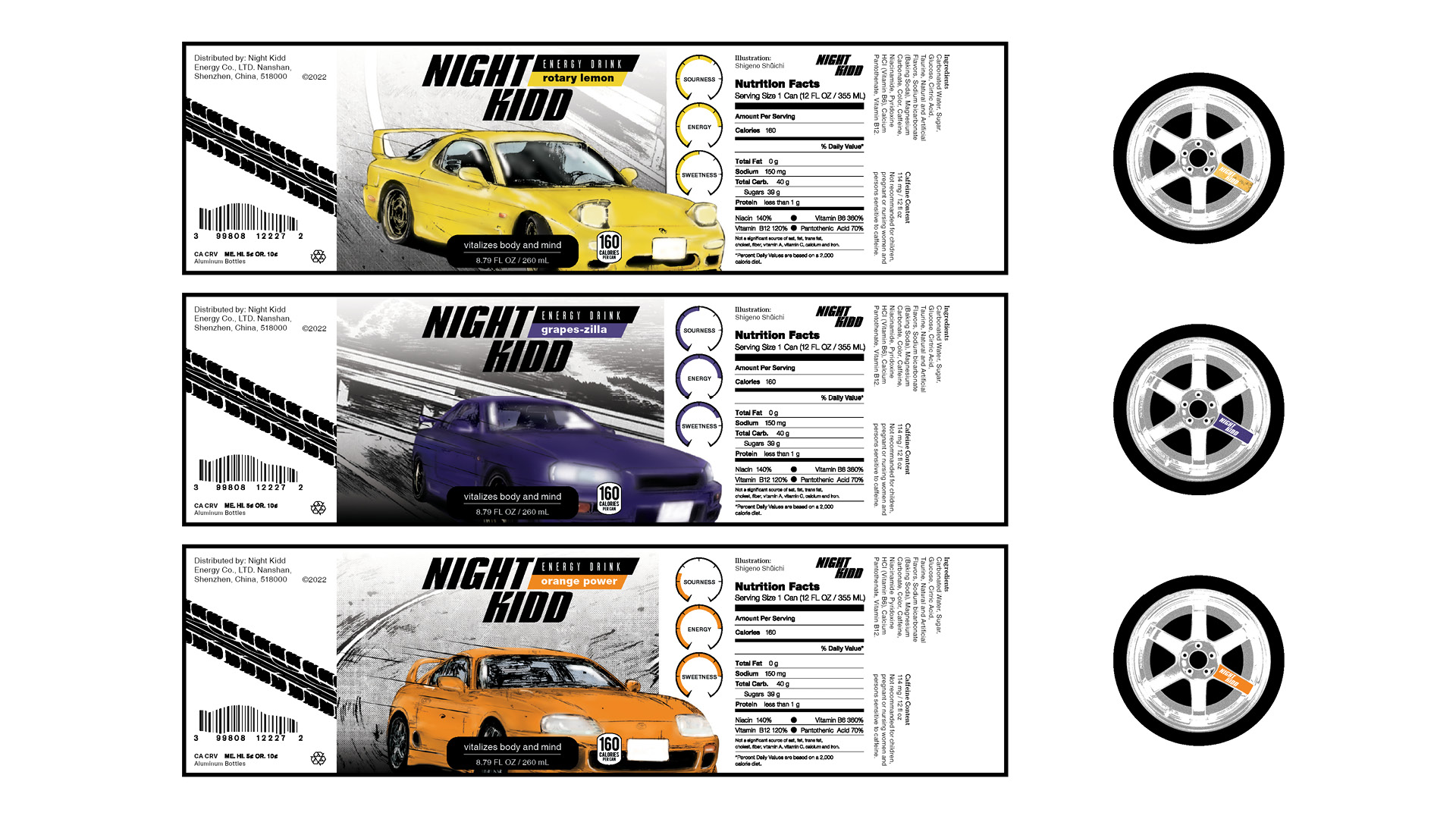
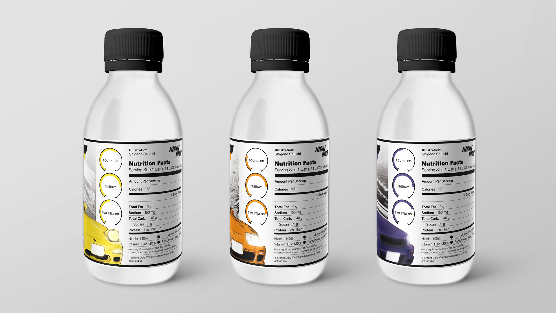
" The main visual design uses the comic style of Initial D, with colors matching the drink’s taste. Dashboards display the different flavors’ sourness, sweetness, and energy. The bottle cap is designed based on the iconic TE37 wheel, a well-known JDM rim. "
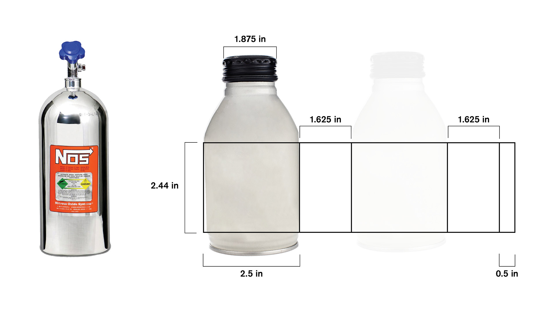
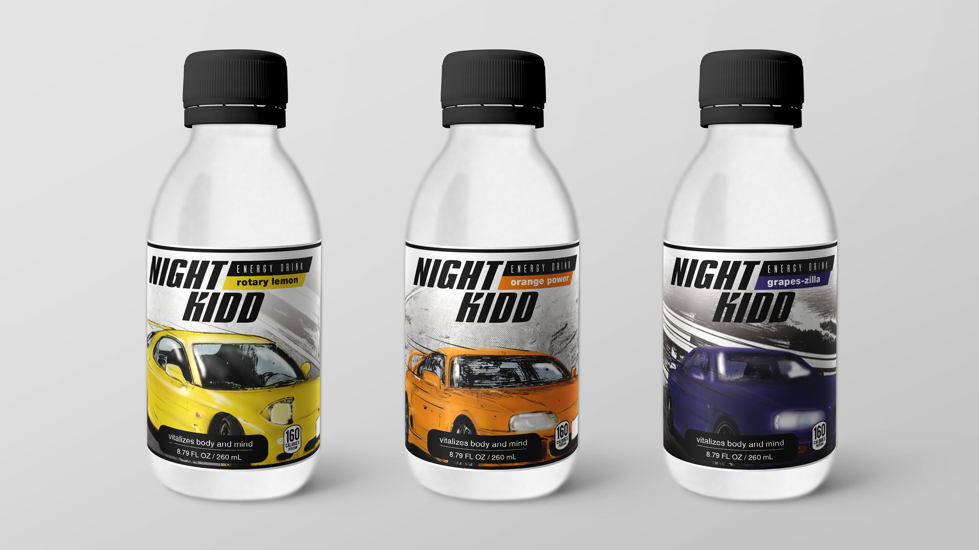
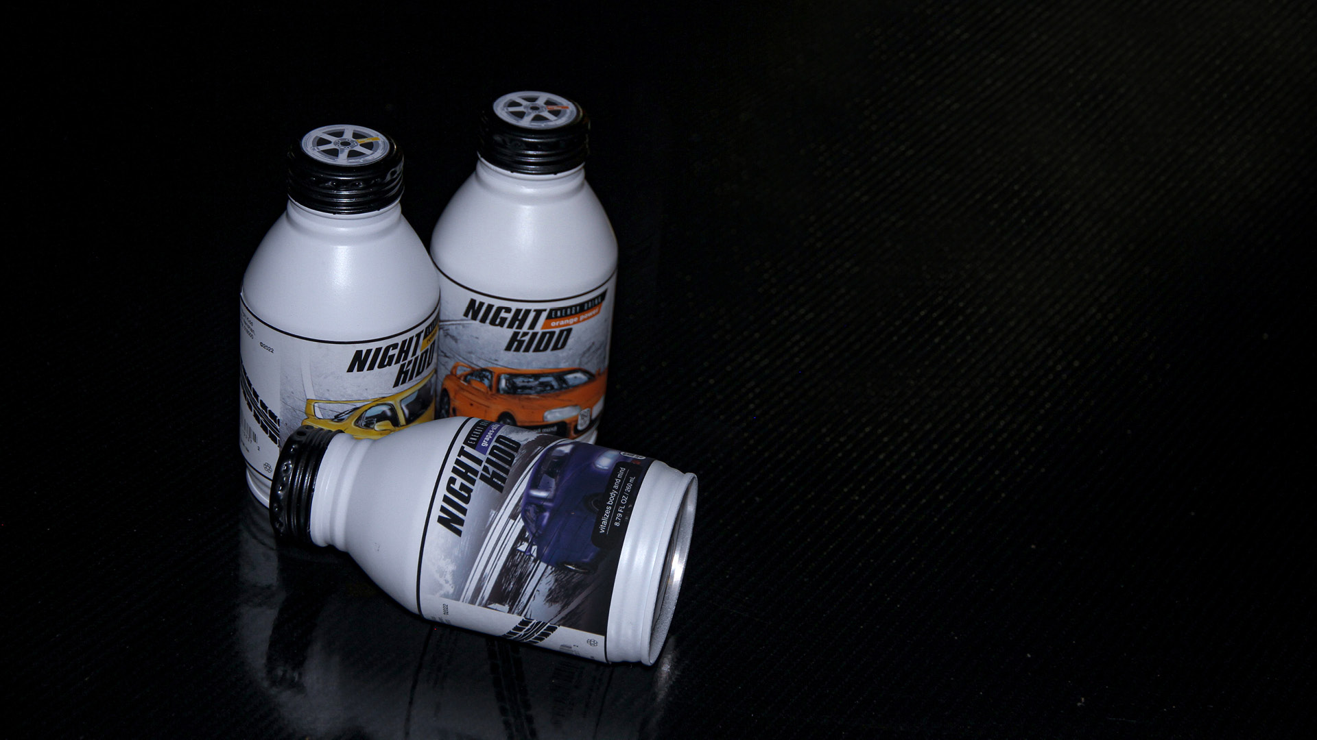
" The container is inspired by the shape of the NOS, which is often used during races due to its potential to briefly power the vehicle. Like NOS’s purpose, Night Kidd brings energy to the driver while driving. "
© 2026 Shengjie Wu. All Rights Reserved.