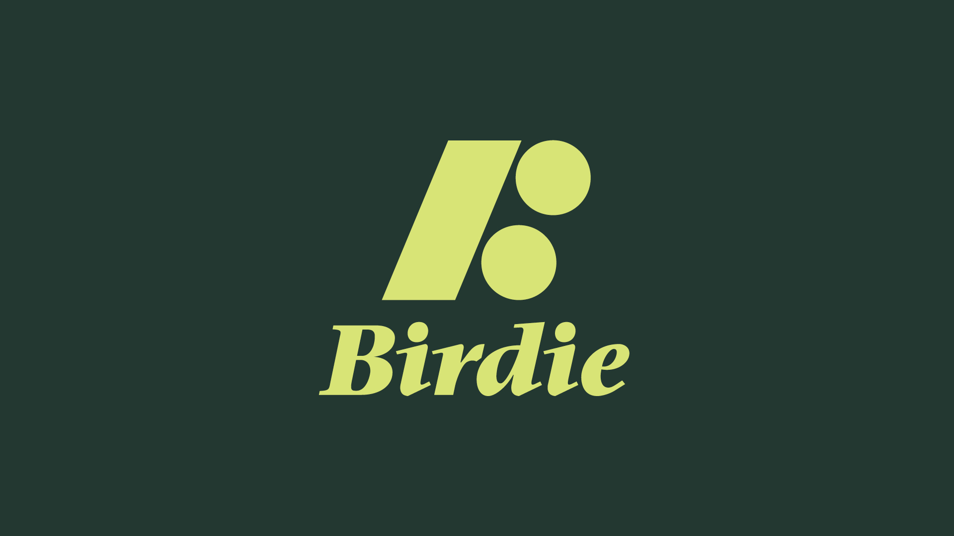
" The geometric logo combines two golf balls and a golf club to form the shape of a “B.” The slightly angled typeface reflects the elegance of golf, while also suggesting the speed and motion of a swing. "
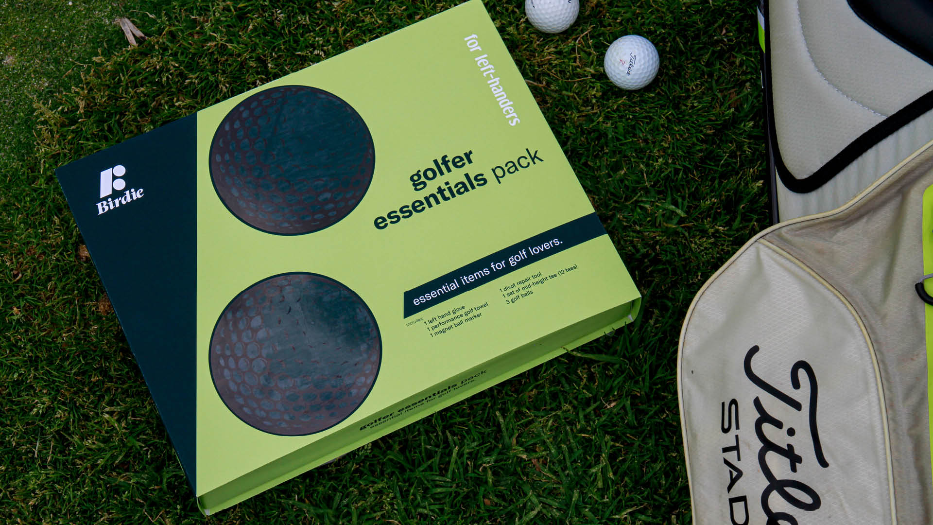
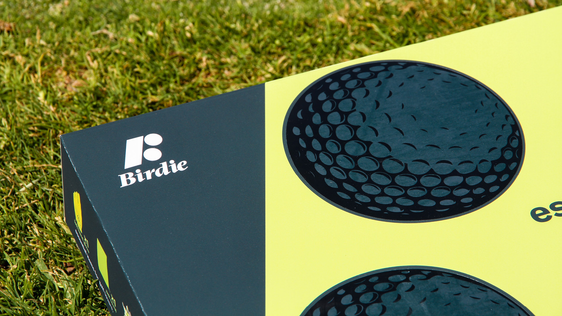
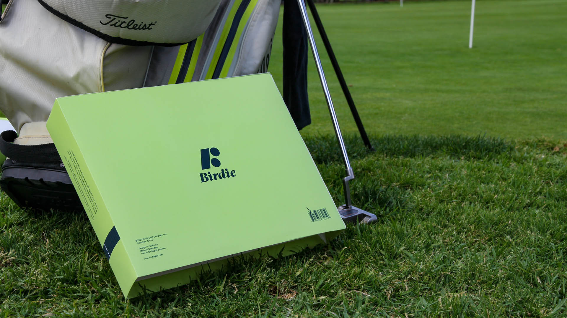
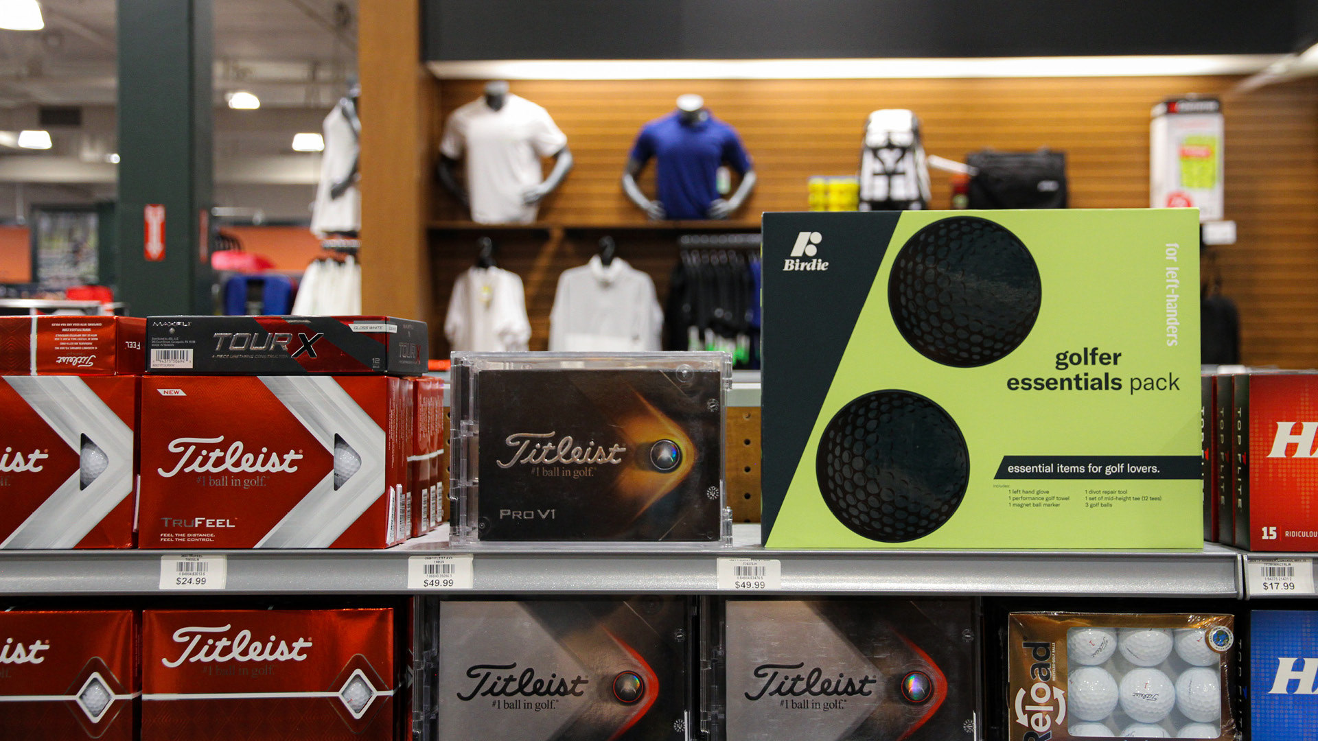
" Compared to other golf products on the market, Its minimalist design, typography, and bright color palette make Birdie stand out among many golf products "
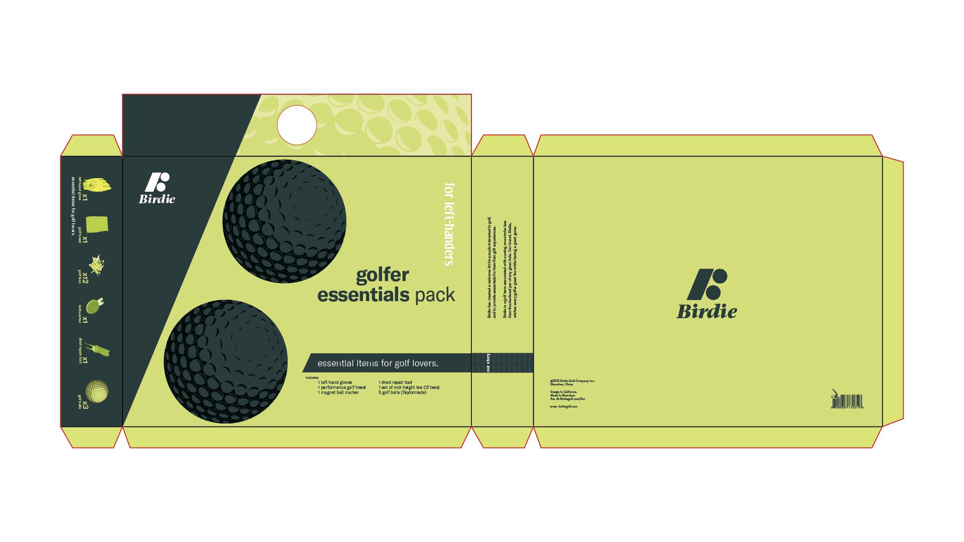
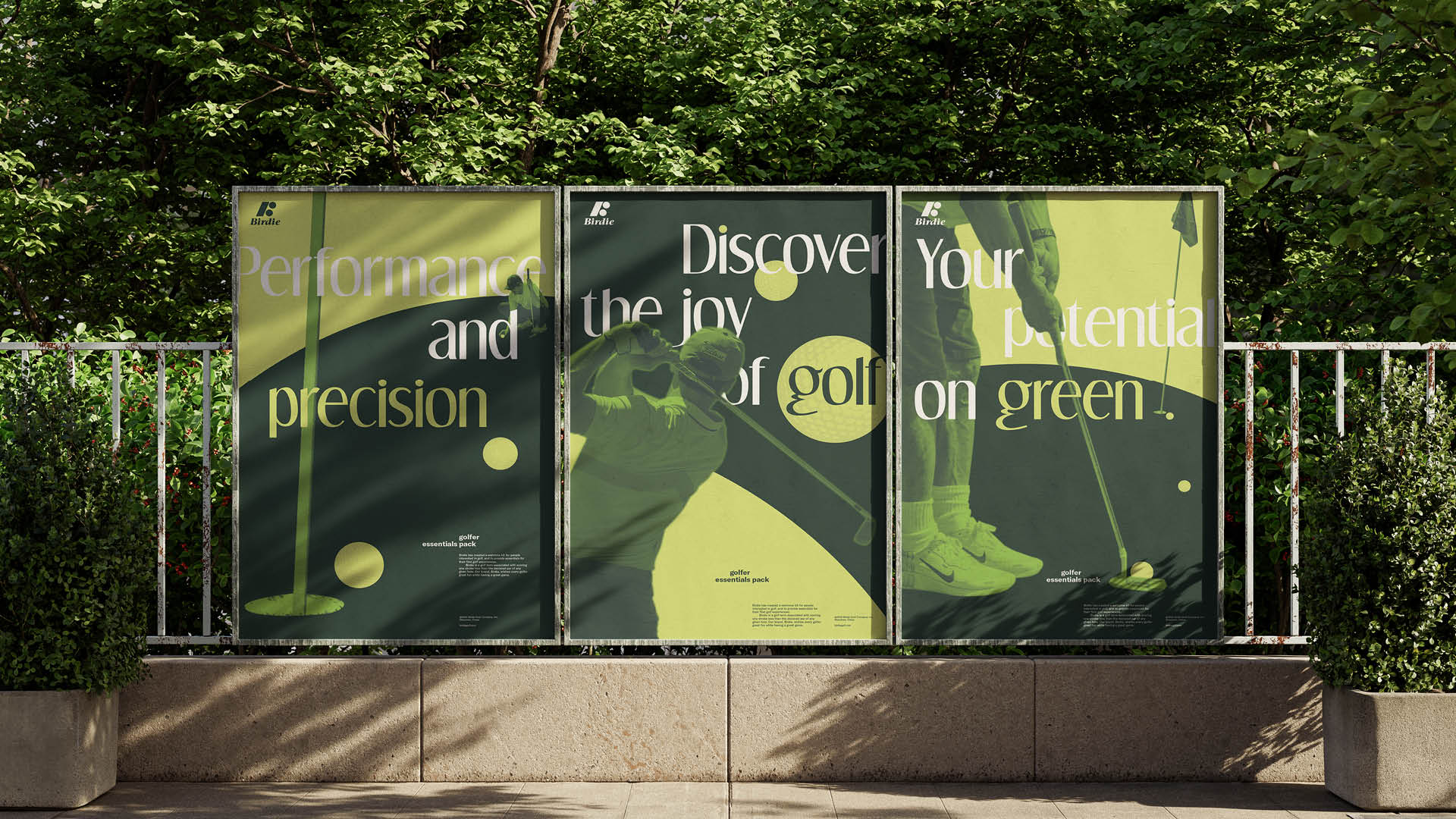
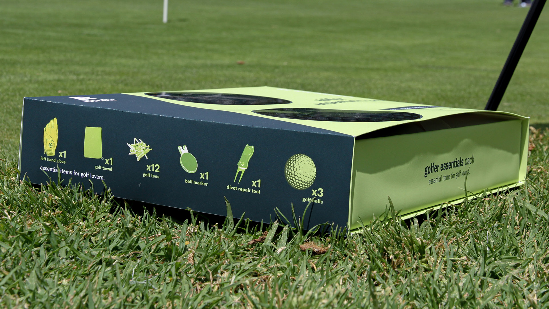
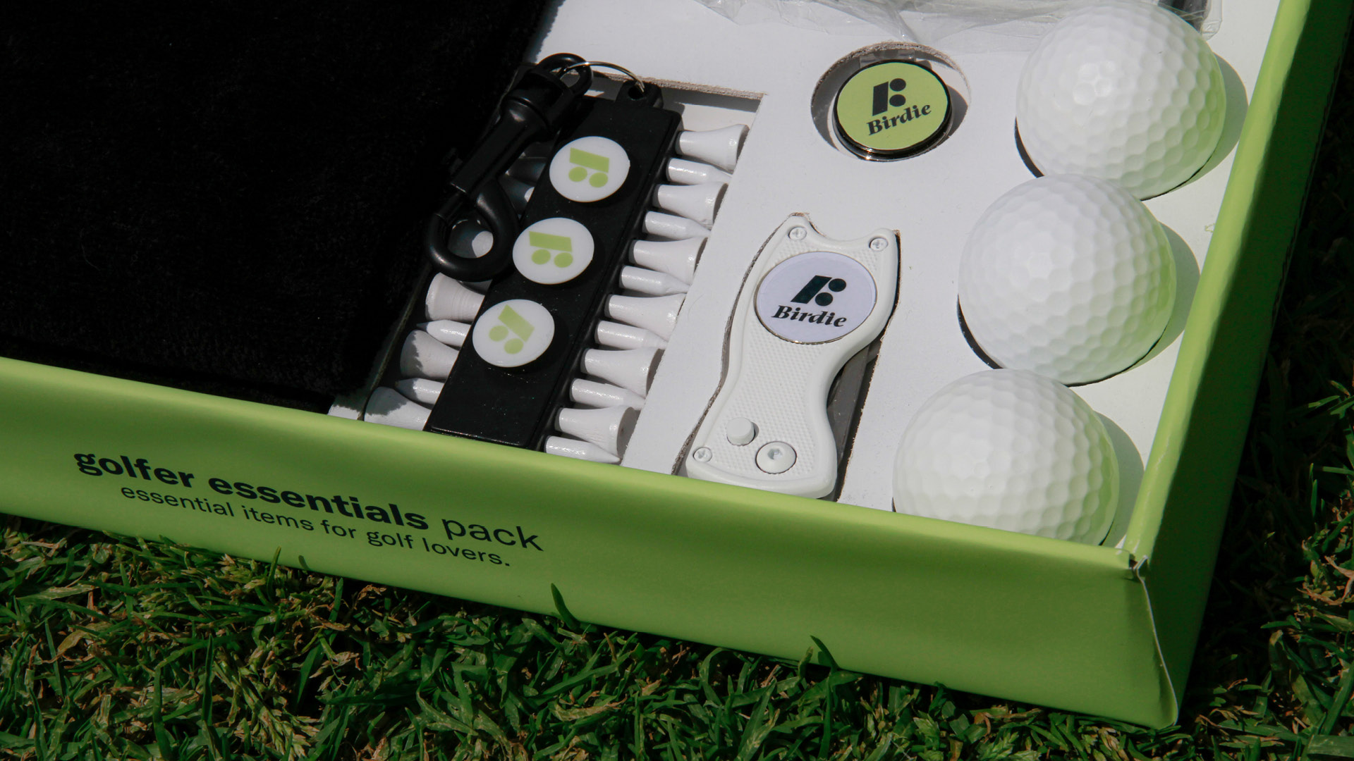
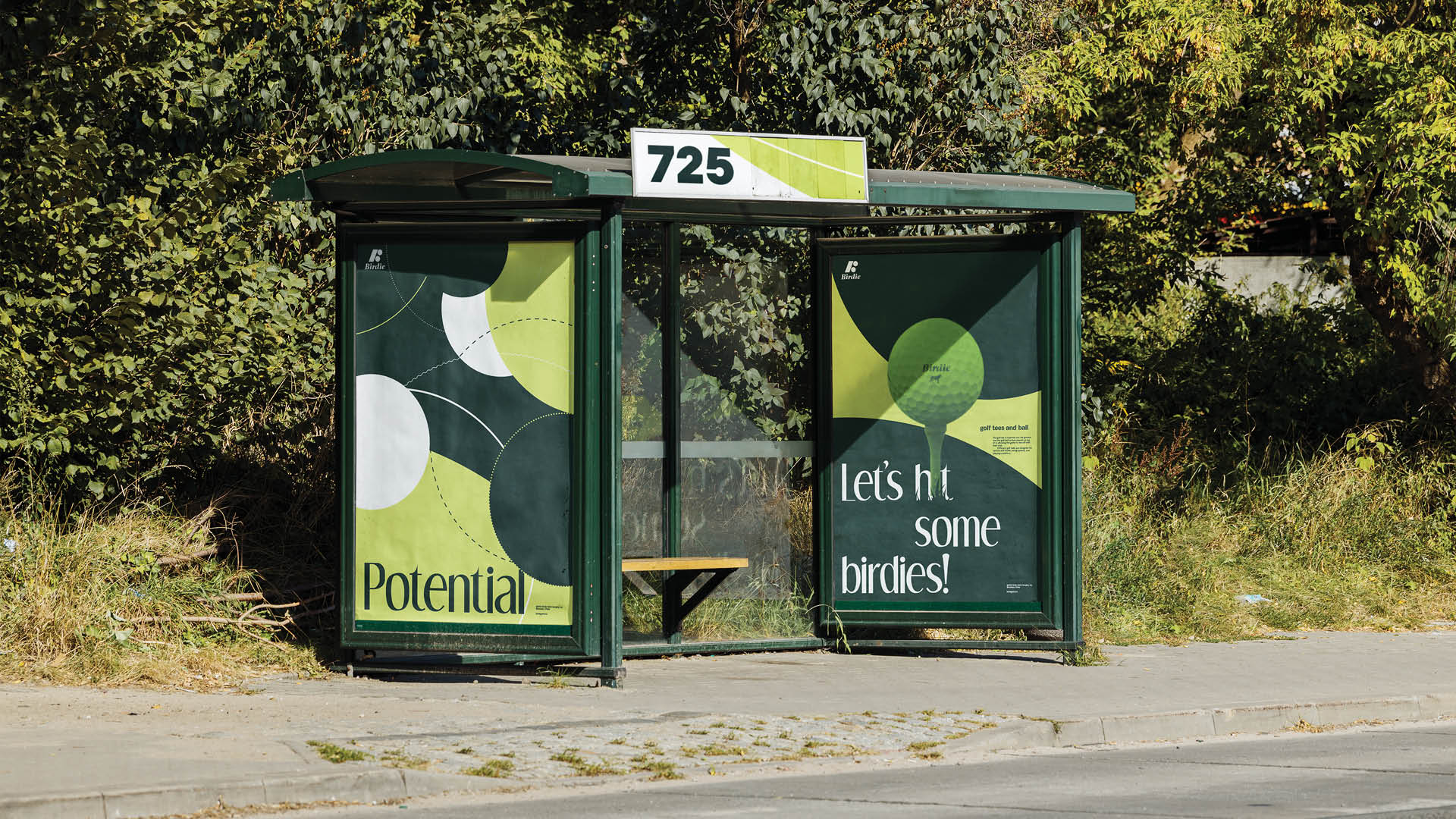
" The circular element on the logo is used to convey the ball's trajectory with the swing movements. Different objects in the kit are also displayed on the poster. At the same time, the characteristics of golf and the core concept of birdie are conveyed in geometric illustrations. "
Communication Arts – 2025 Typography Shortlist
Young Ones – 2023 ADC Nominated Shortlist
© 2026 Shengjie Wu. All Rights Reserved.